Visual identity, spatial design, installations and wayfinding for the new London headquarters of premium cycling apparel brand, Rapha.
Part workplace, part workshop.
Having outgrown their offices at ‘Imperial Works’ in King’s Cross, Rapha asked us to help them devise a name and visual identity for their new headquarters in north London, as part of a wider creative brief to also deliver the spatial design, wayfinding and brand experience in the new building. It needed to capture and express the core values of the brand — of industry and initiative, effort and reward — and position their new home as a modern collaboration space, a workshop for experimentation and excellence, and the best place in the world to work as a cyclist.
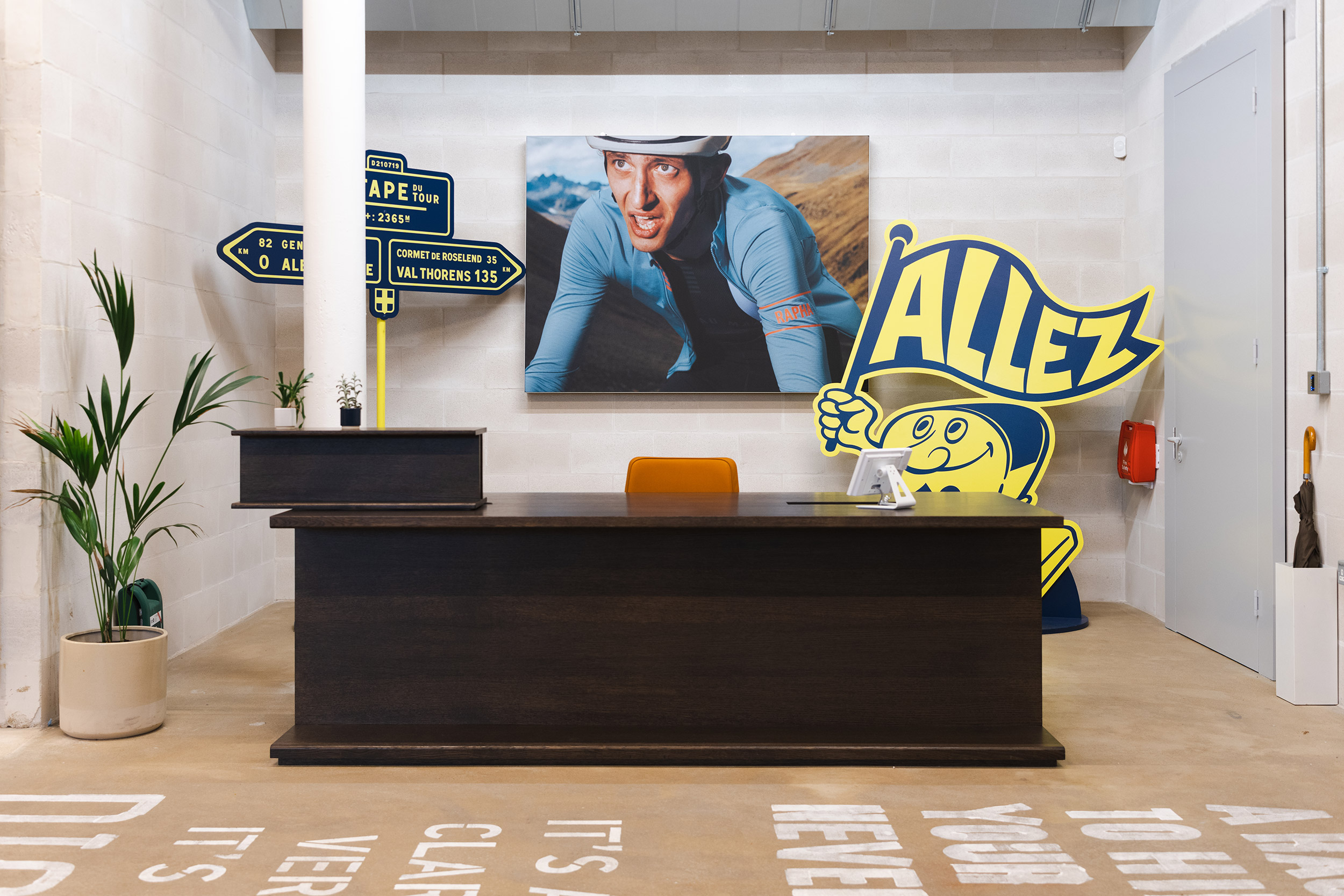
With a layered blend of design, storytelling and installations, we gave a voice to Rapha’s brand values, as well as their roots in the sport of cycling, to create a rich and rewarding workplace experience for employees and visitors — from a poetic painted road, to a vintage H–Van decorated in the ‘team colours’ of Rapha’s most iconic jerseys worn in World Tour races; from large-scale typographic accounts of classic races, to a welcoming wall of previously unseen archive photography.
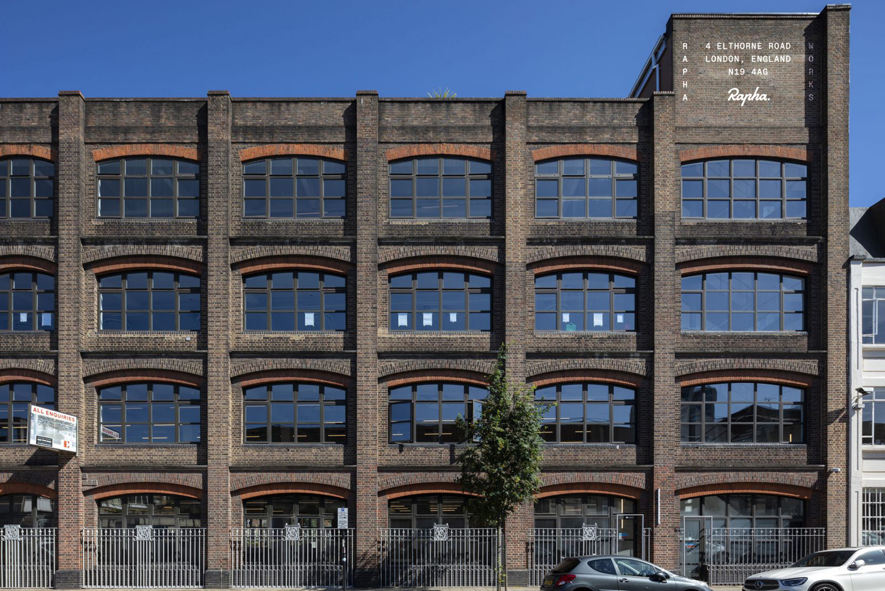
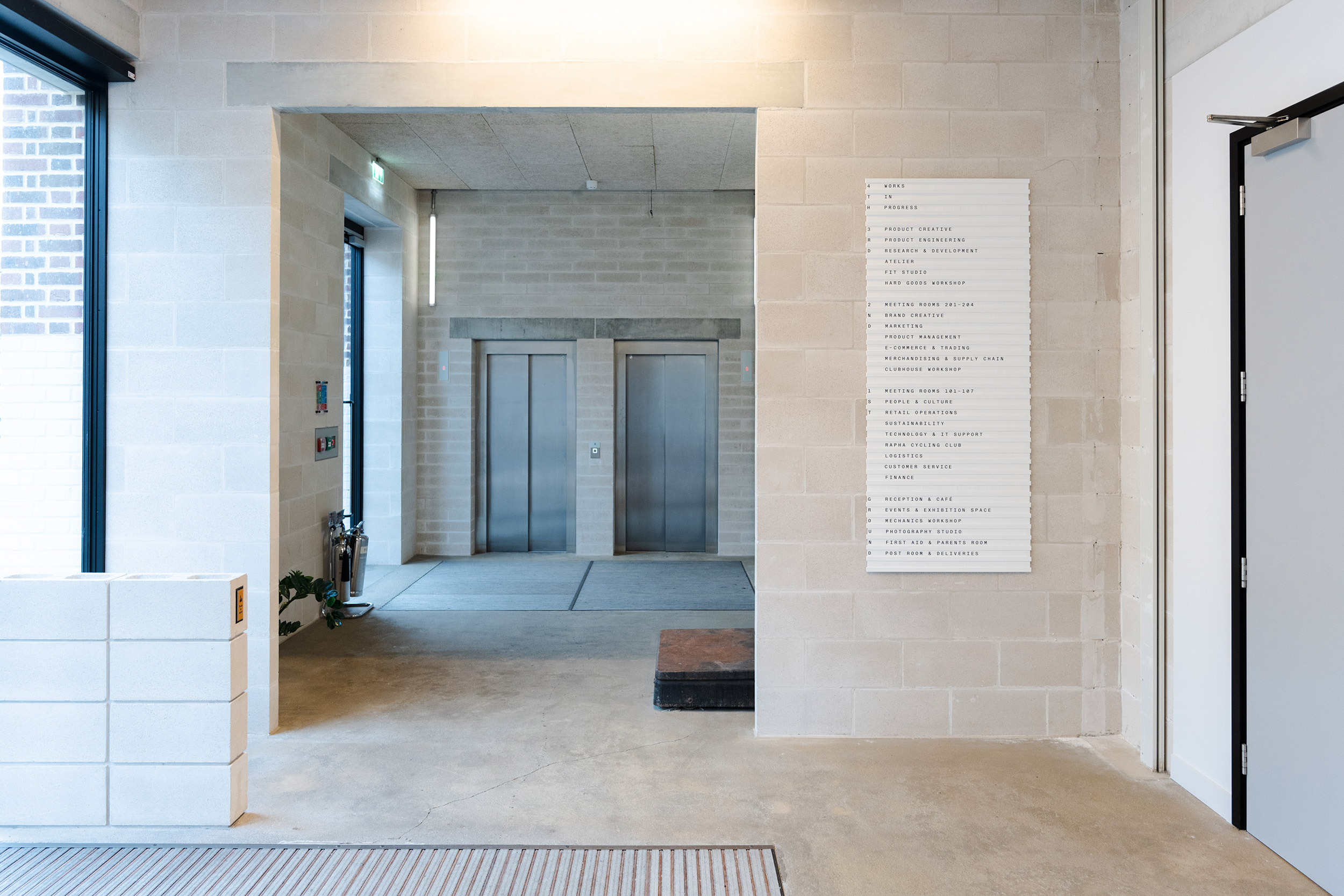
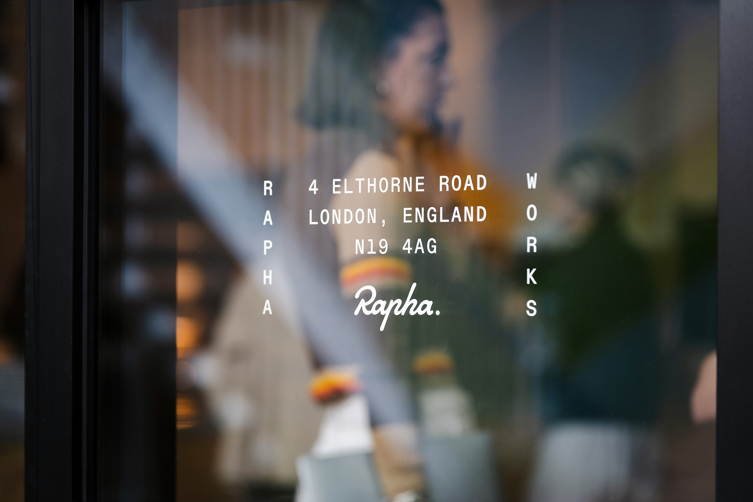
The name RAPHA WORKS encapsulates the honesty and industry of the notion of the ‘workshop’, as well as inferring the higher ideals of the world-class creative work that takes place there. The logo makes direct reference to the form and verticality of the building — five floors of modern open plan space — with a visual language that’s hard-working and with a keen eye for detail.
The logo’s monospace typography and its vertical behaviour is carried throughout the building as part of a fabricated signage system, informed both visually and materially by the functional workshop aesthetic we developed.
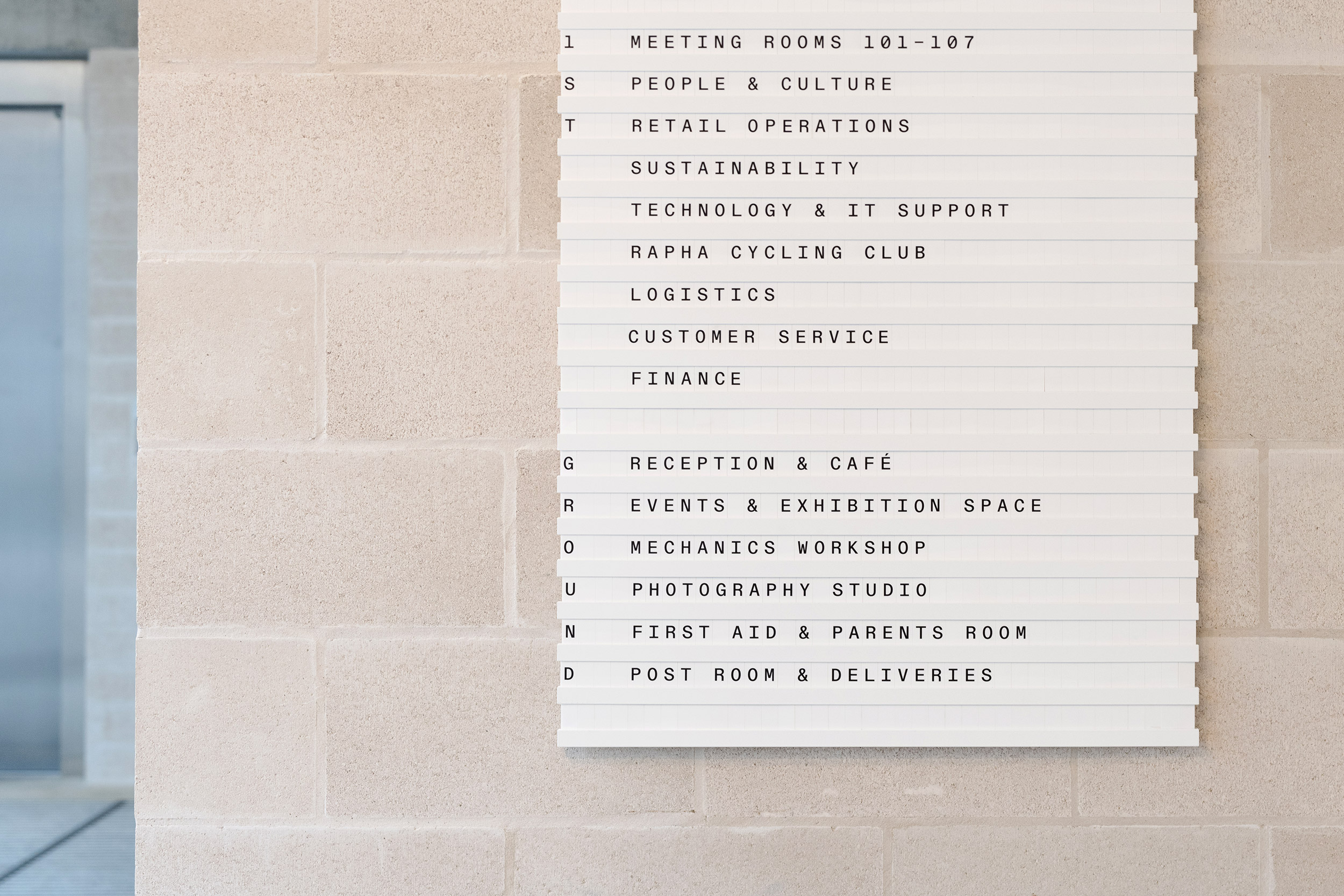
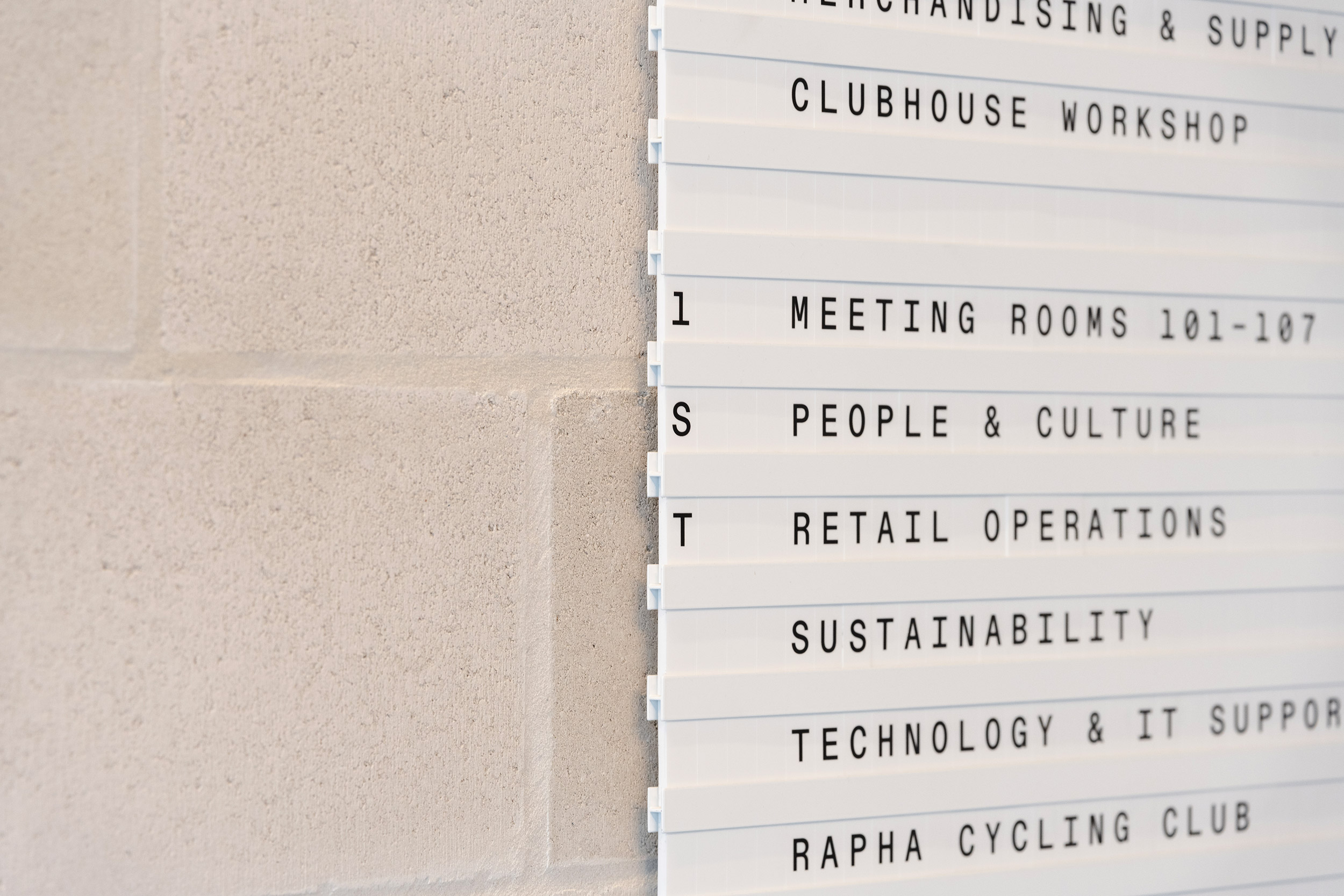
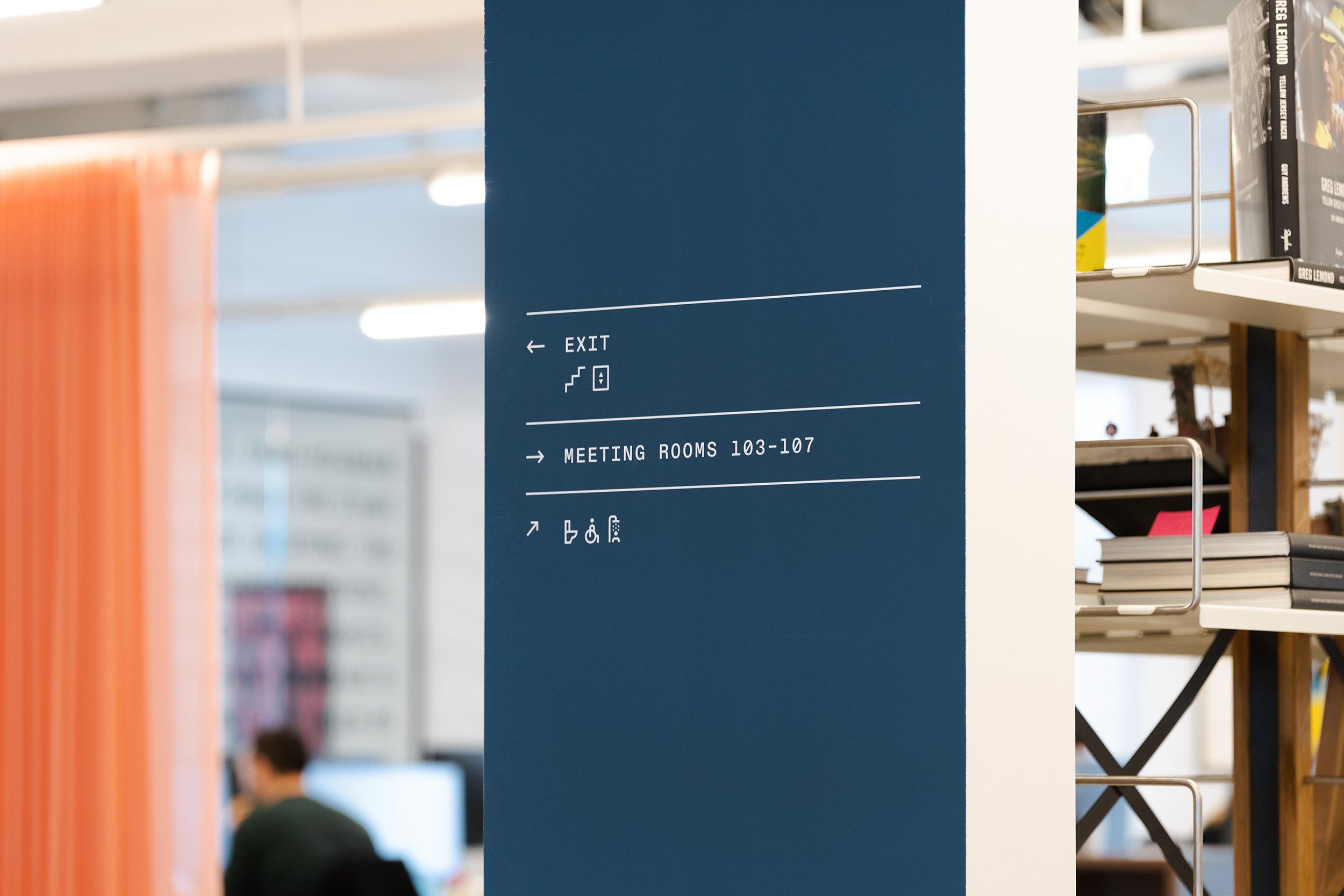
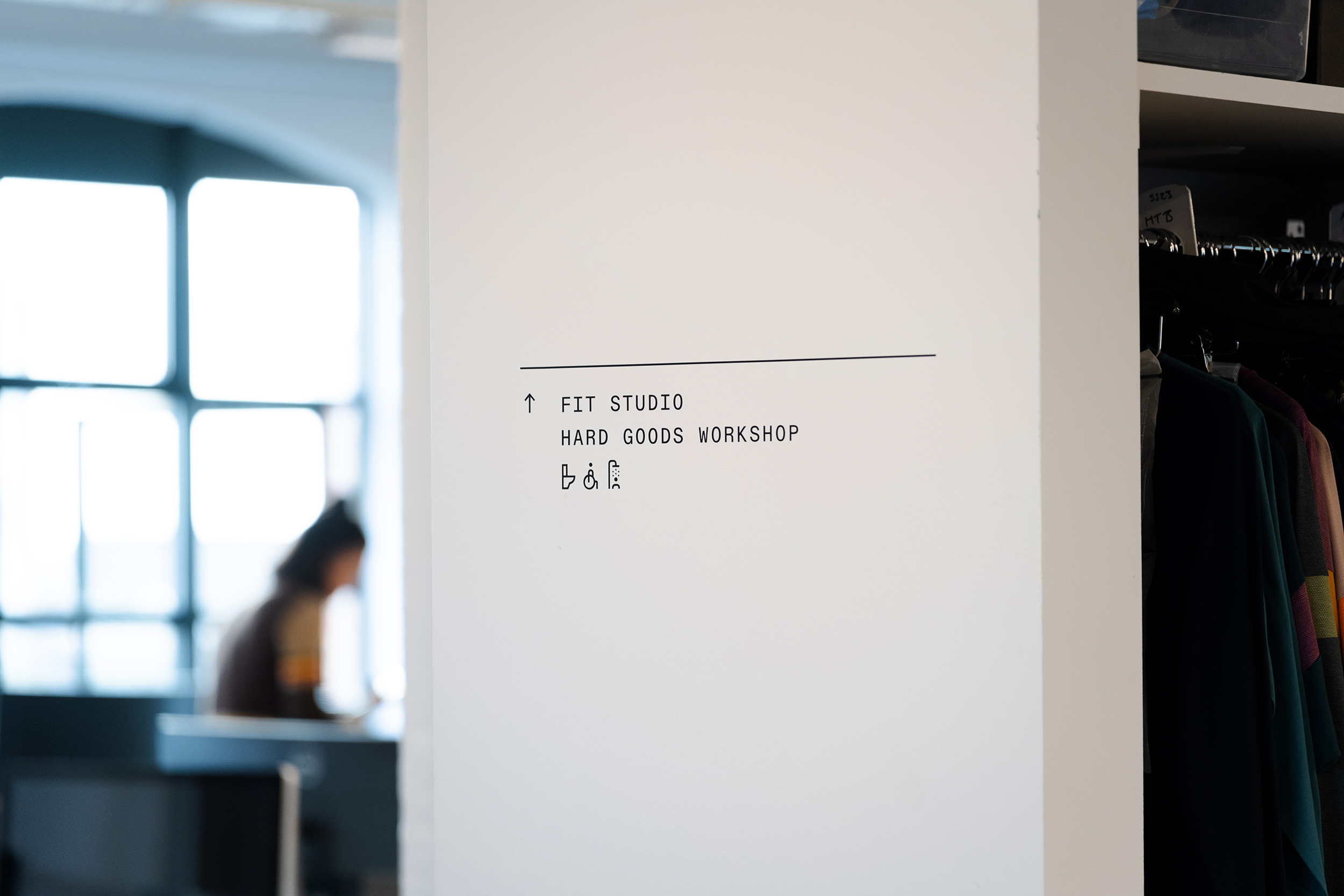
As part of the wayfinding design, we created a complementary set of pictograms that take their cues from some of the formal aspects of the monospace typeface, as well as from the italic angles and full stop of the Rapha script logo.

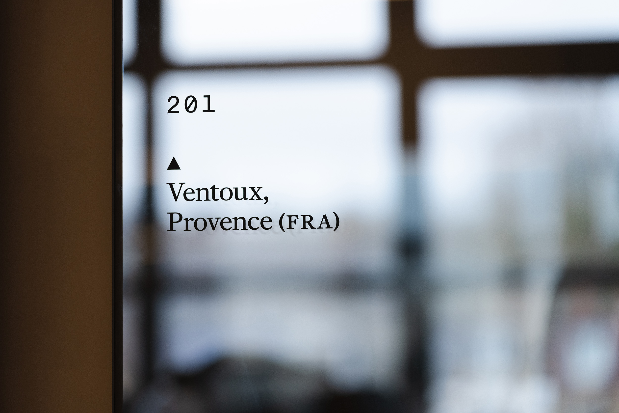
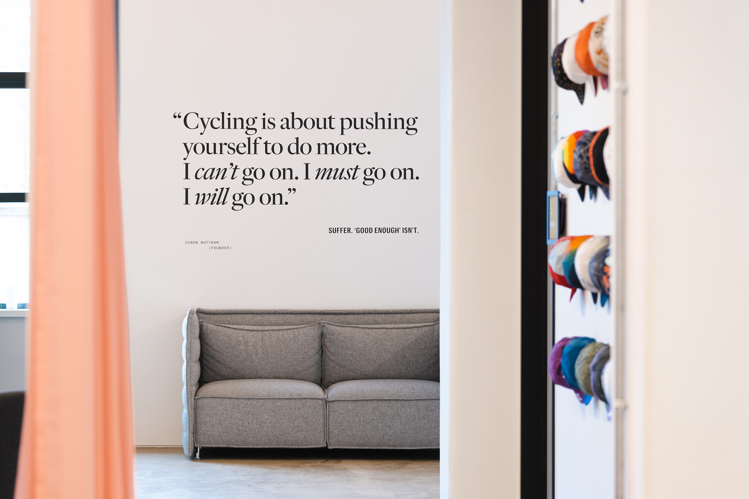
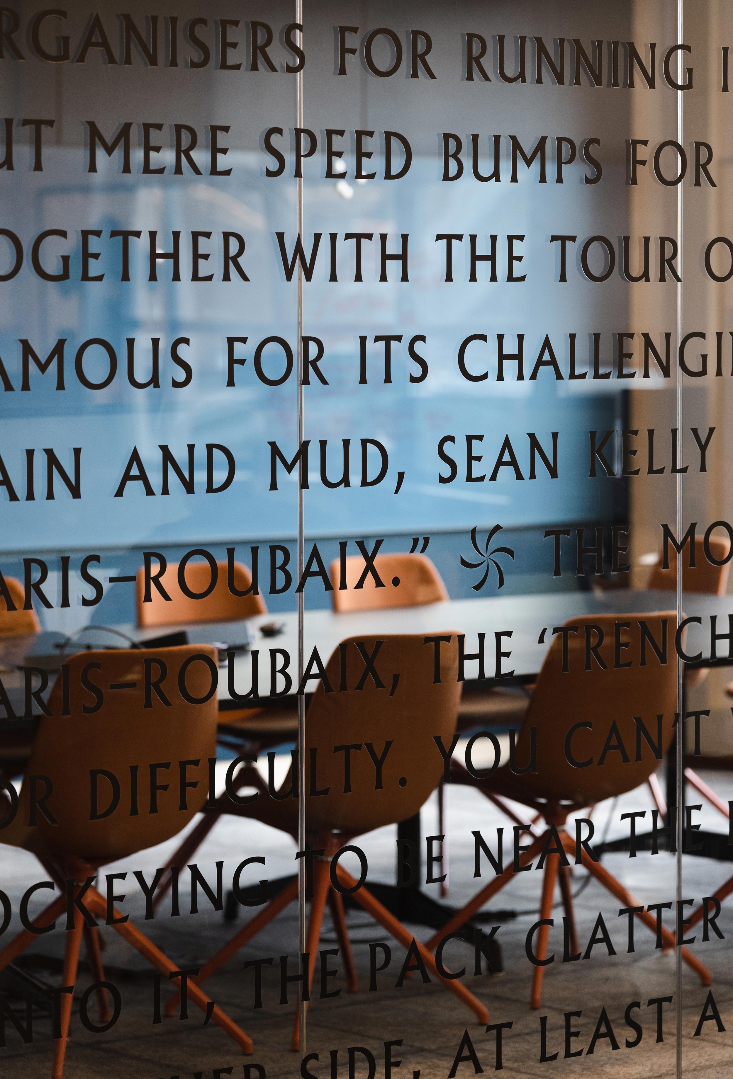
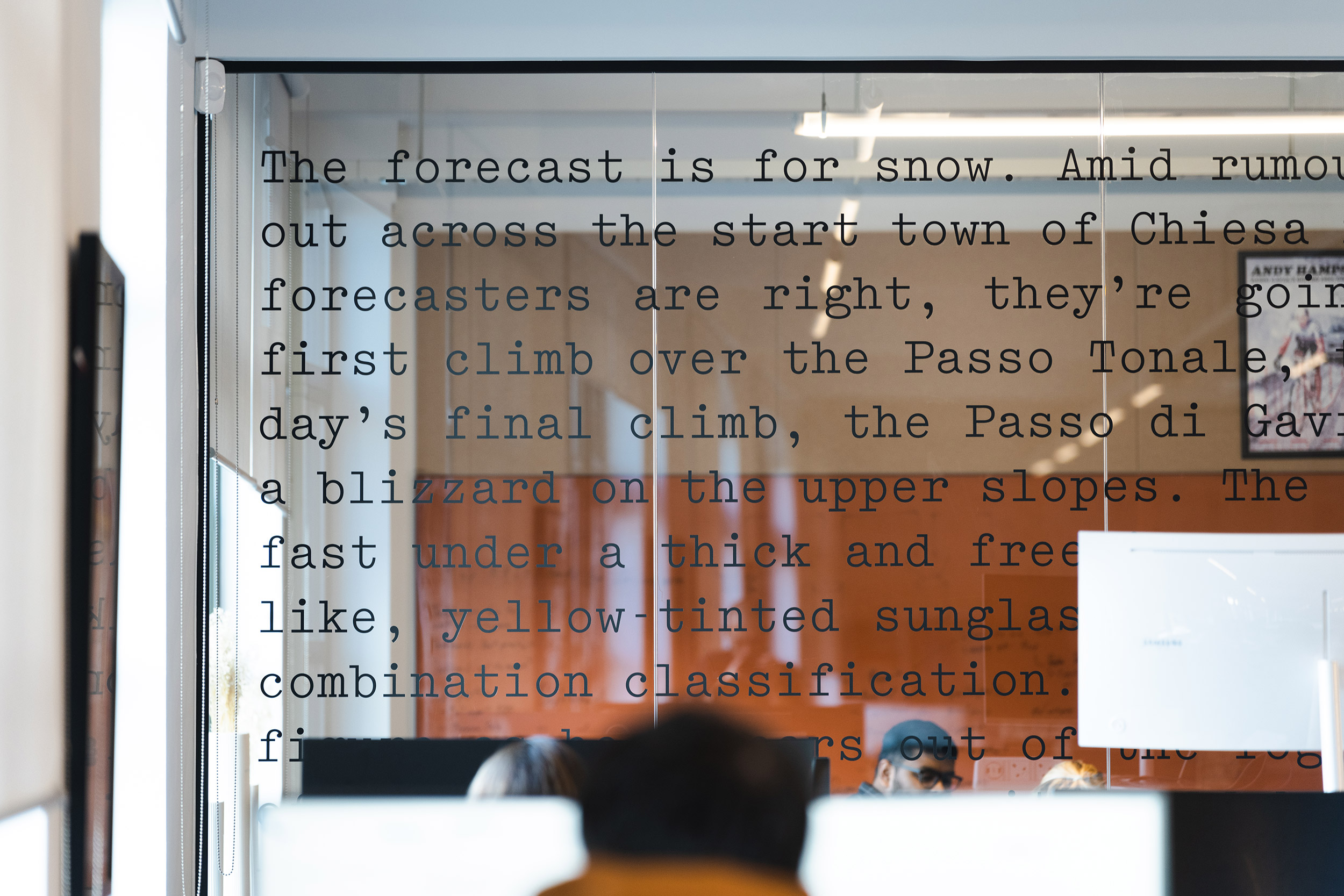
A mix of brand and campaign typography provides rich storytelling throughout the building — everything from quotes from athletes and the brand’s founder, Simon Mottram, to ‘inside stories’ from staff past and present, alongside race reports from some of the most iconic moments in the sport of cycling.
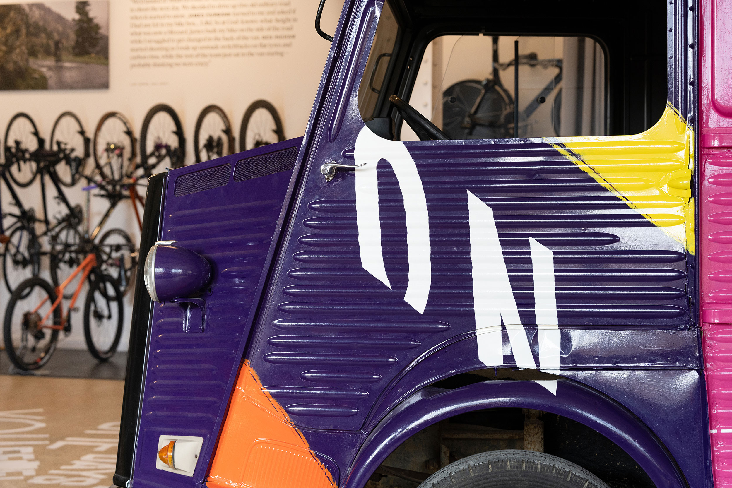
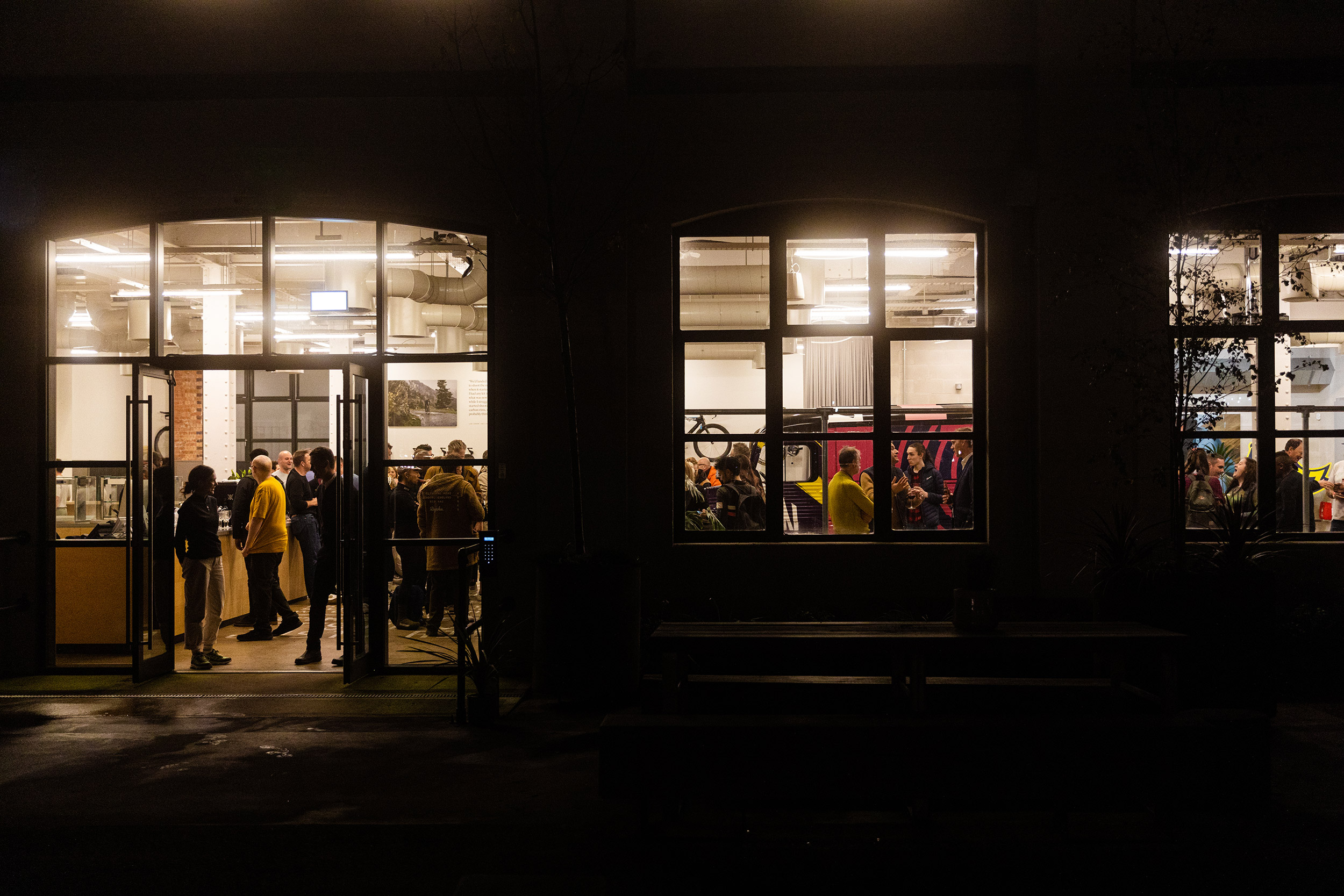
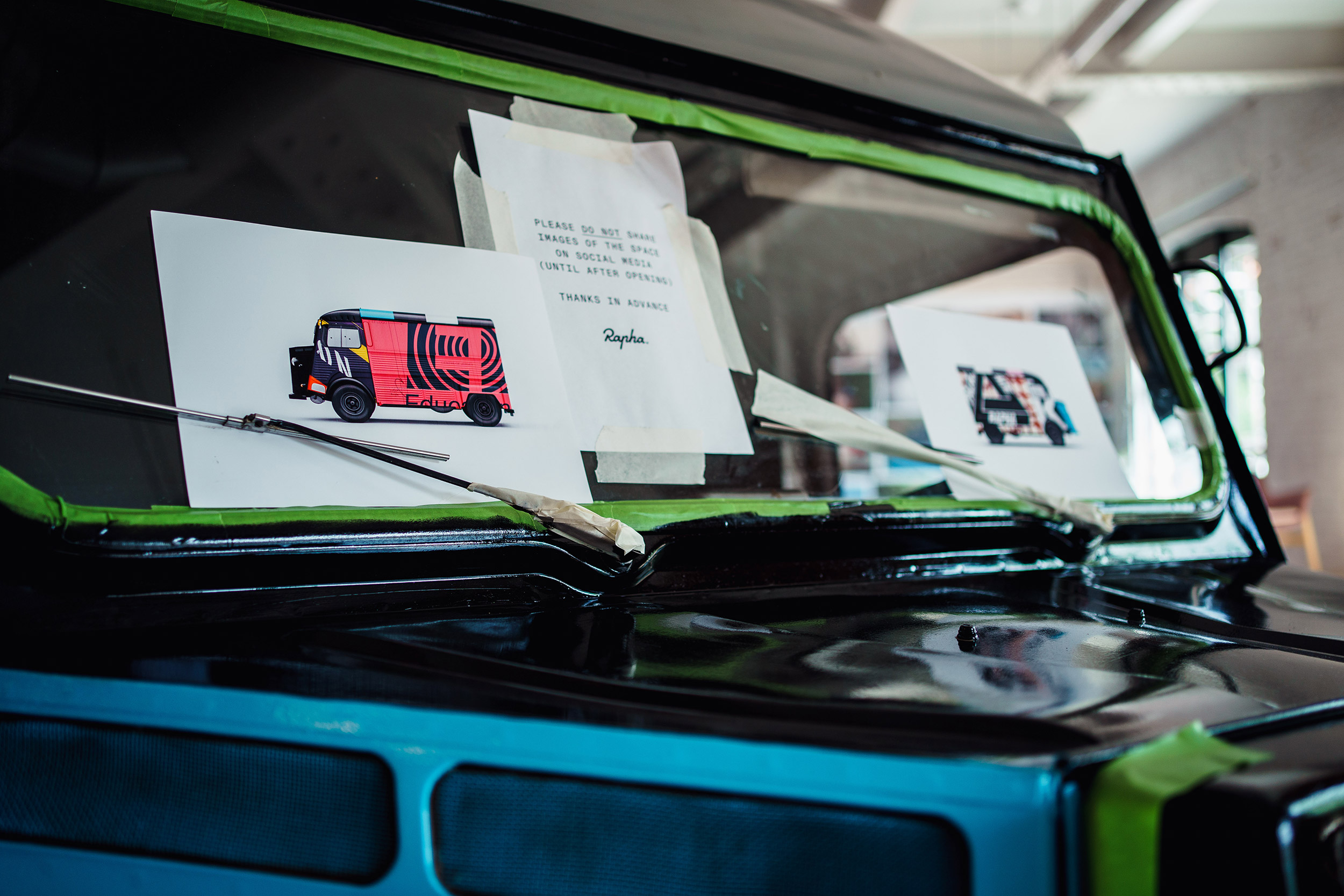
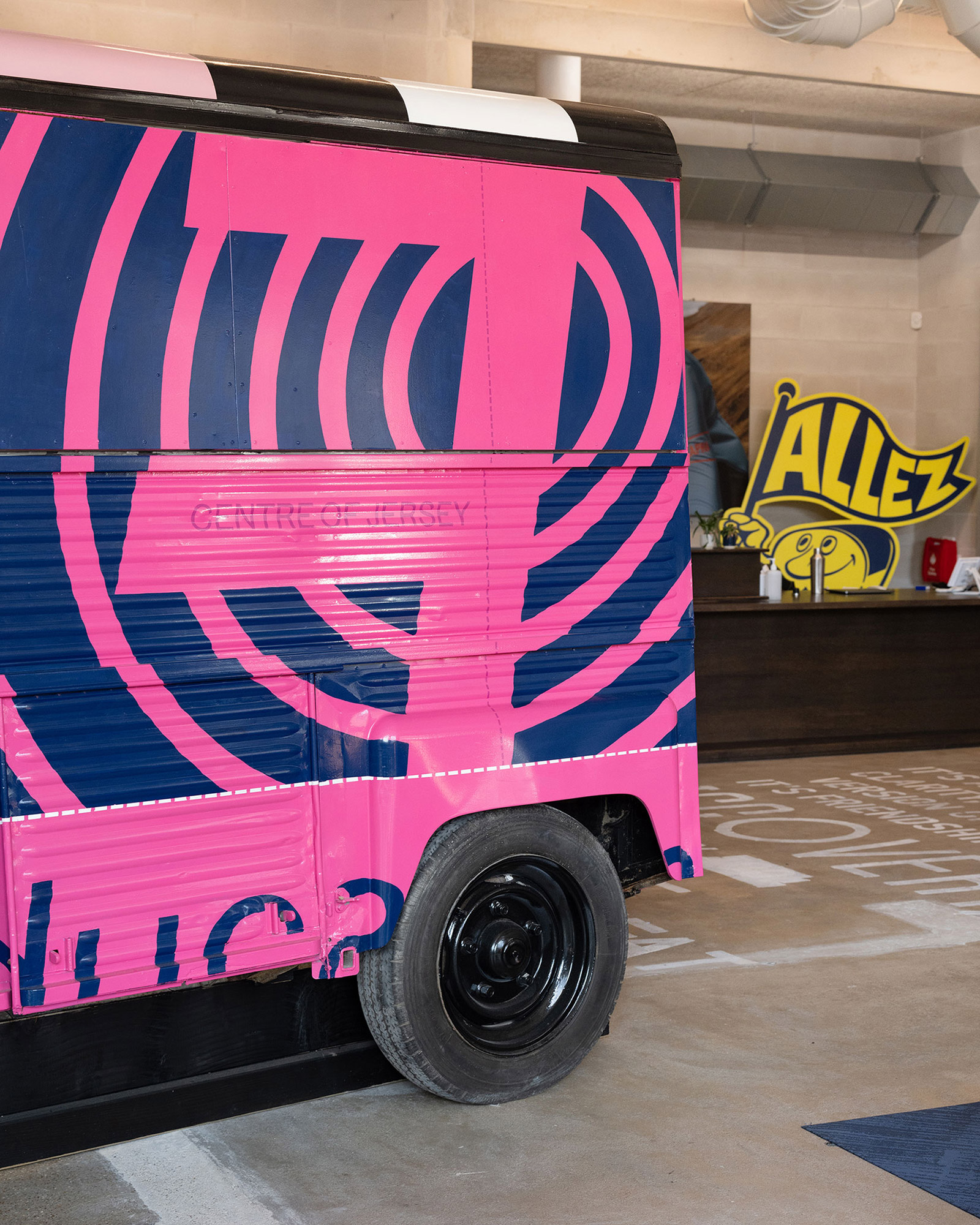
A Citroën H-Van — cycling’s infamous ‘broom wagon’ — is parked in the middle of the main ground floor space. Reimagined in supergraphic details taken from Rapha’s most famous race–winning team jerseys, the vehicle has been re-purposed as a place to display brand new collections inside. We commissioned the multi-talented Many Hands to help bring our hero installation to life.
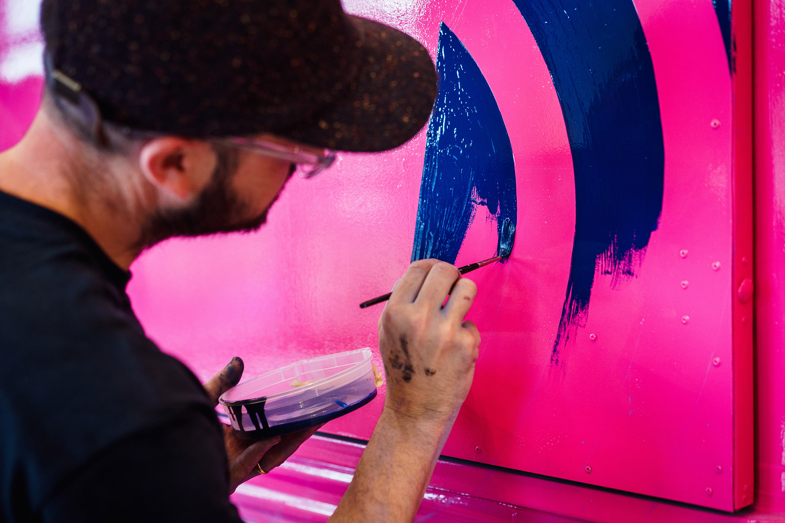
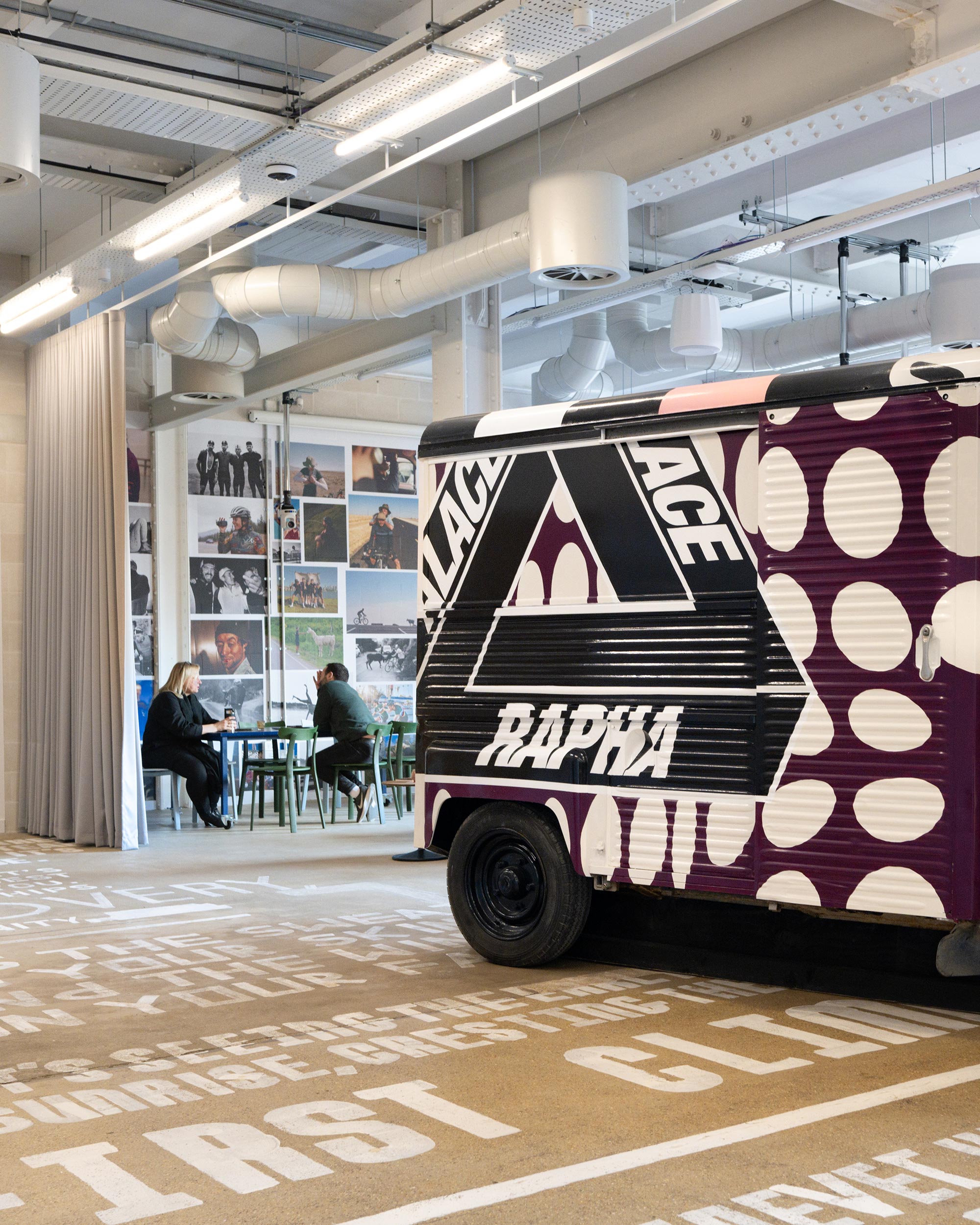
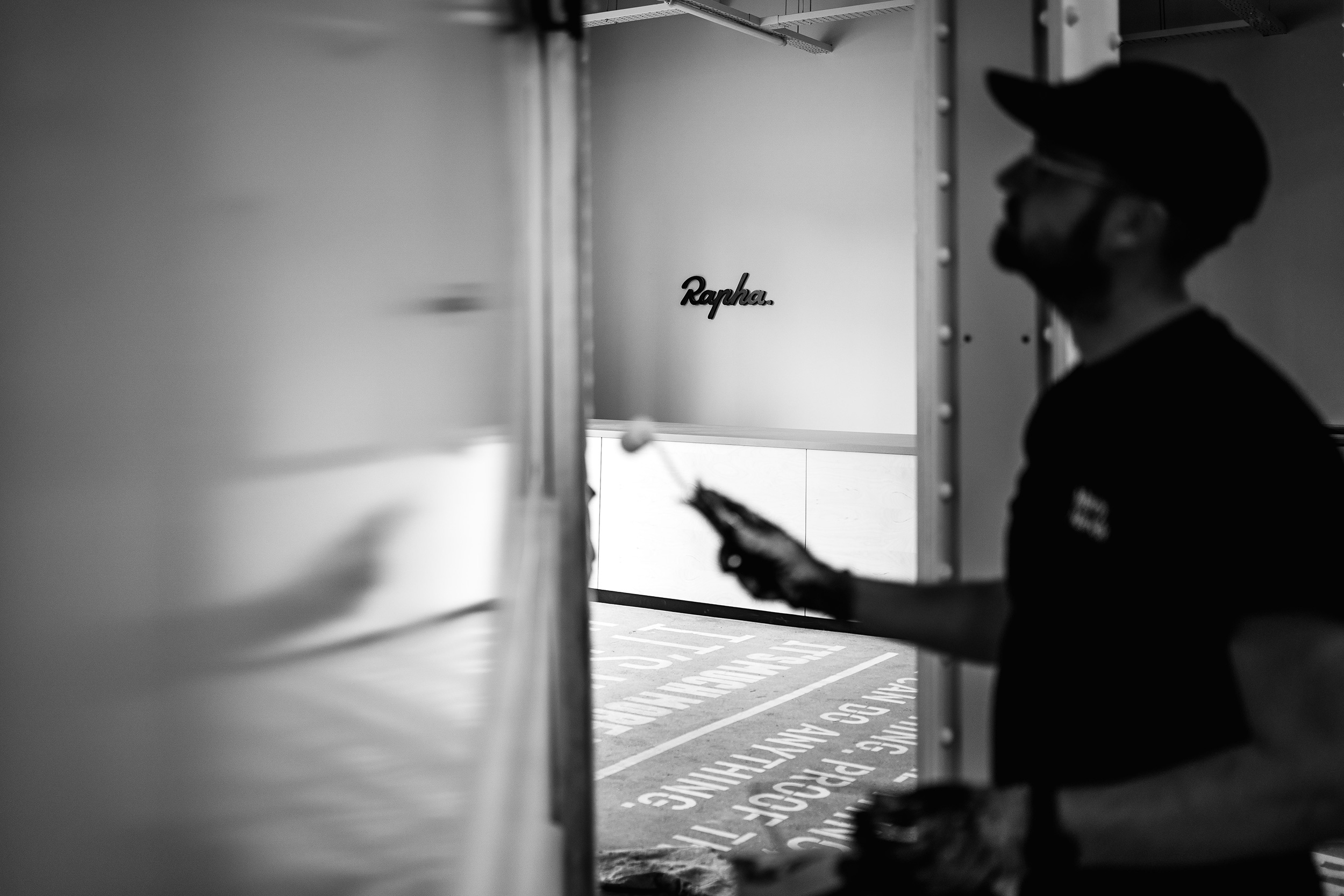
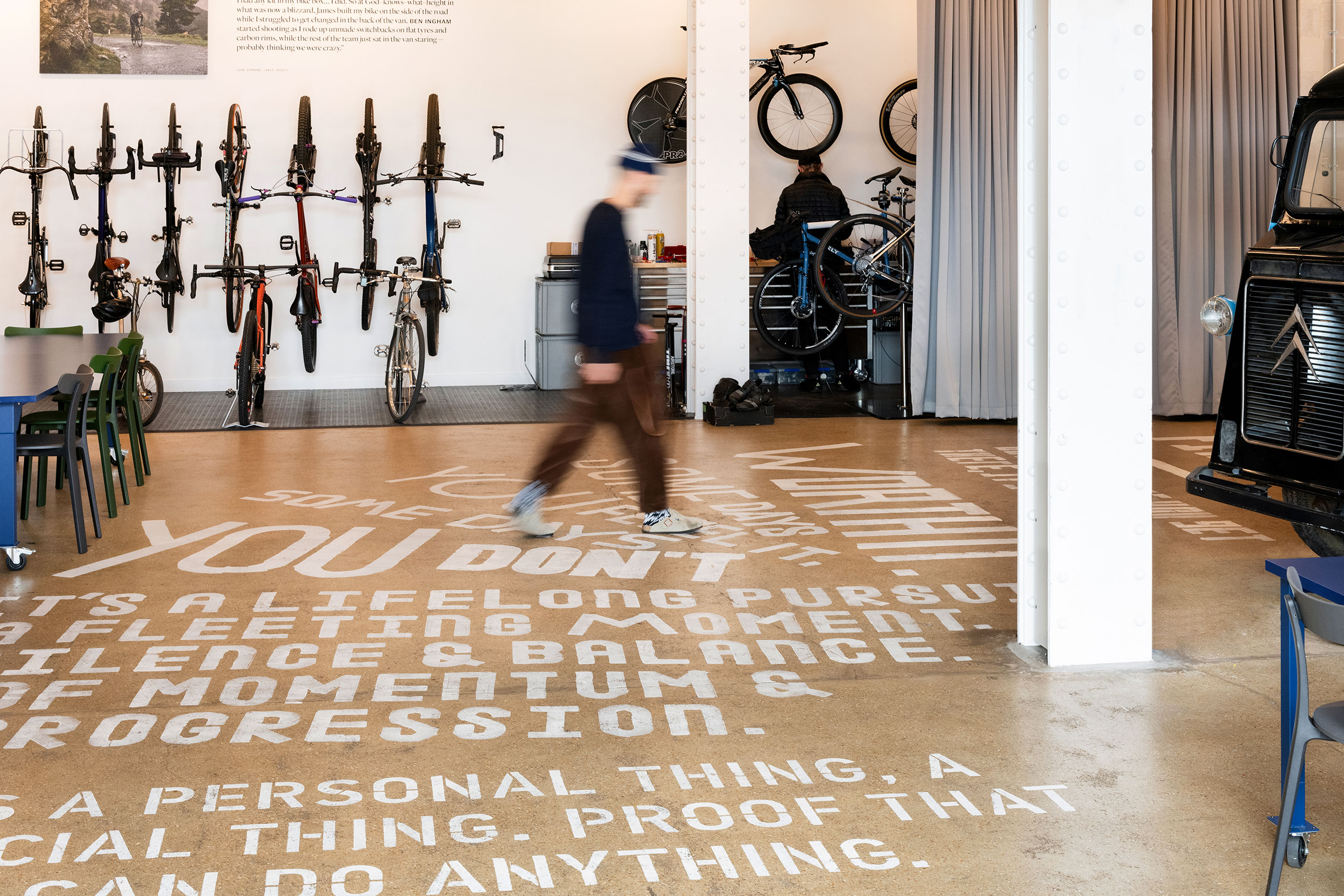
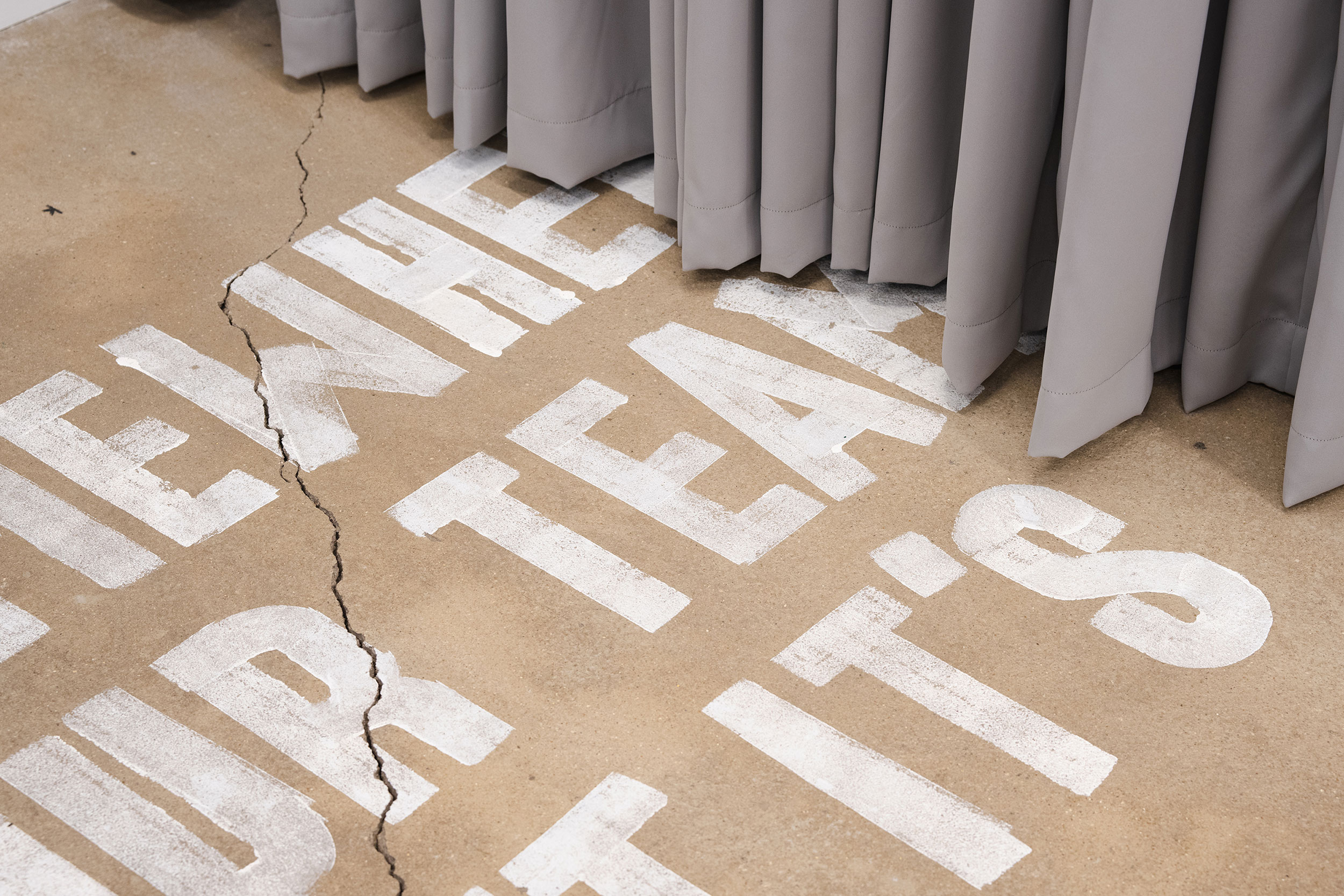
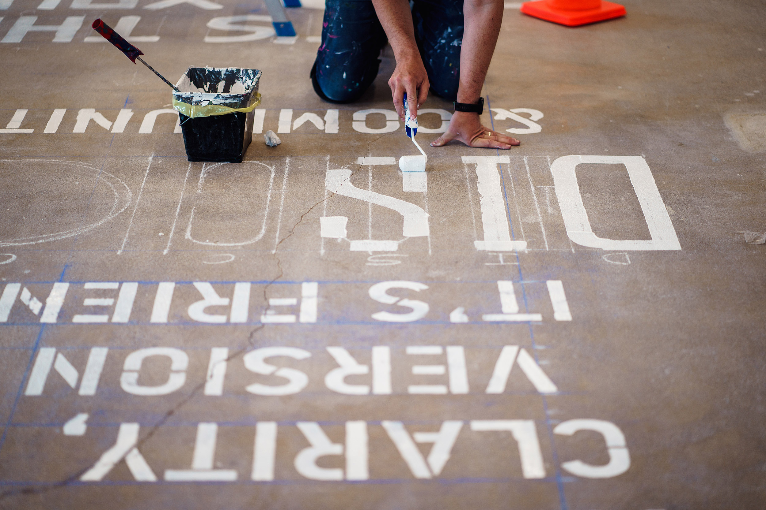
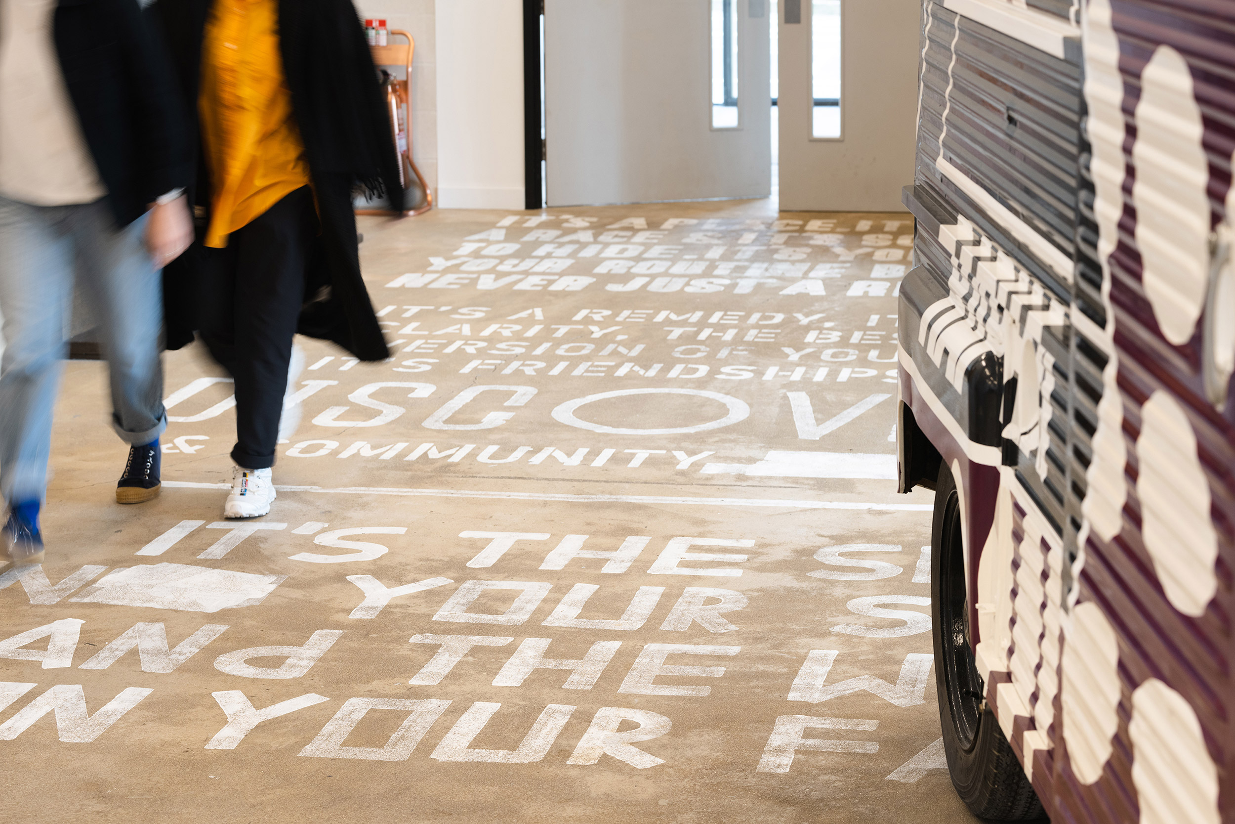
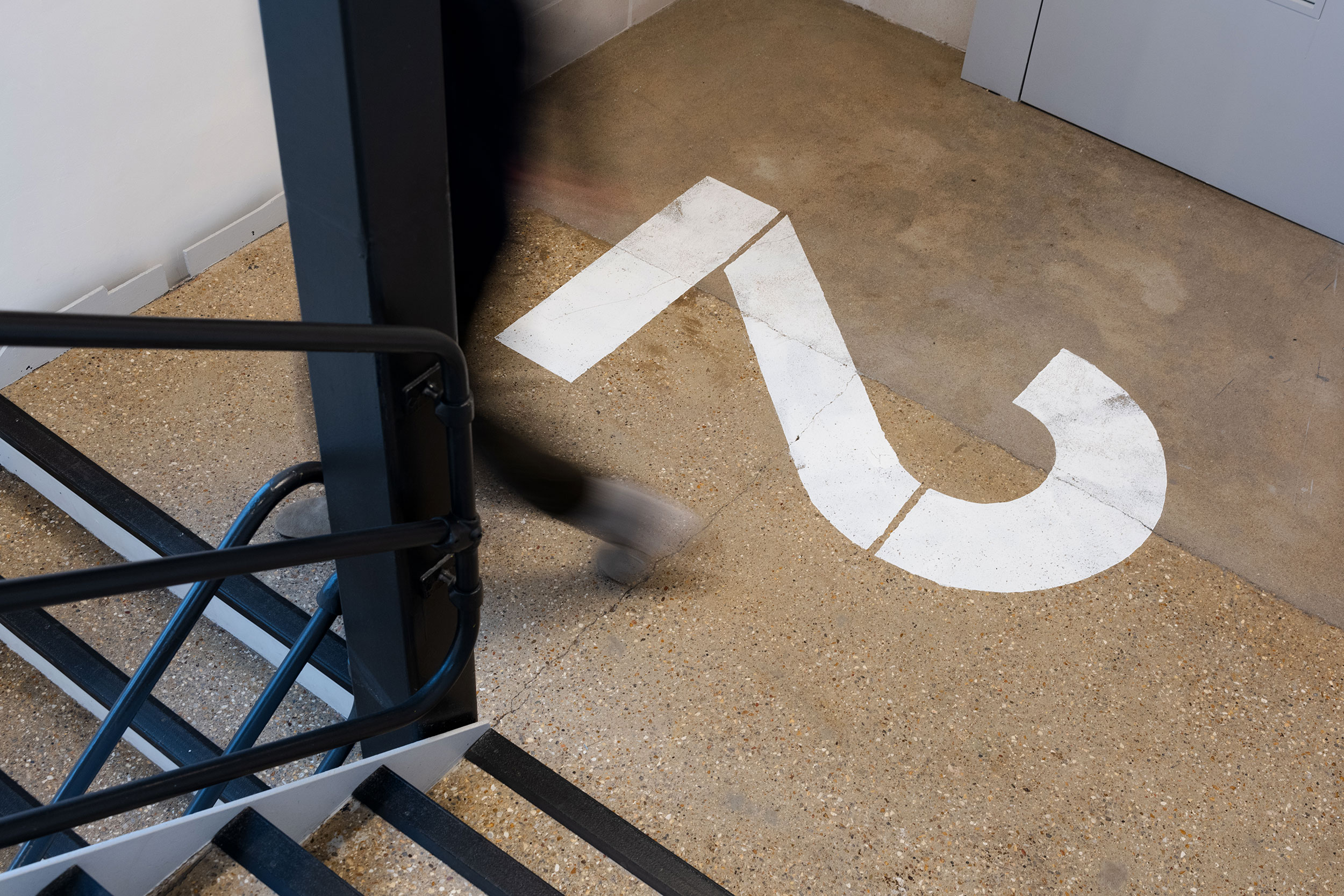
We also collaborated with Many Hands to create a large-scale, poetic artwork painted on the floor. Inspired by the fan-painted roads of the Tour de France, it welcomes visitors into the building, guiding them on their journey onwards, with complementary graphic painted motifs re-appearing on the upper floors.
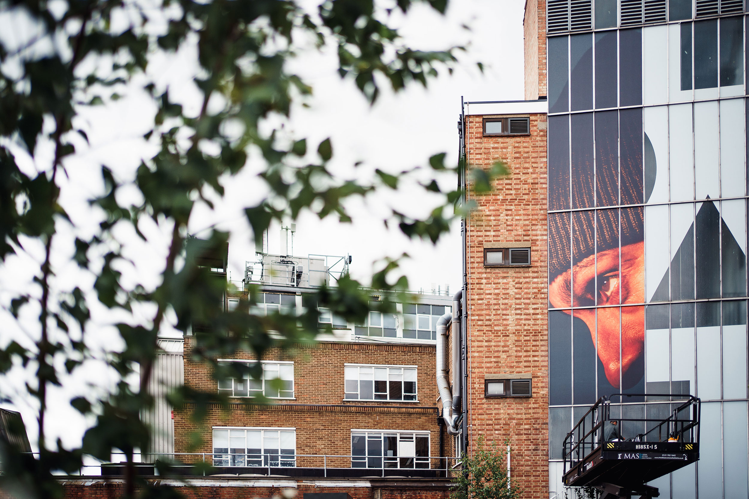
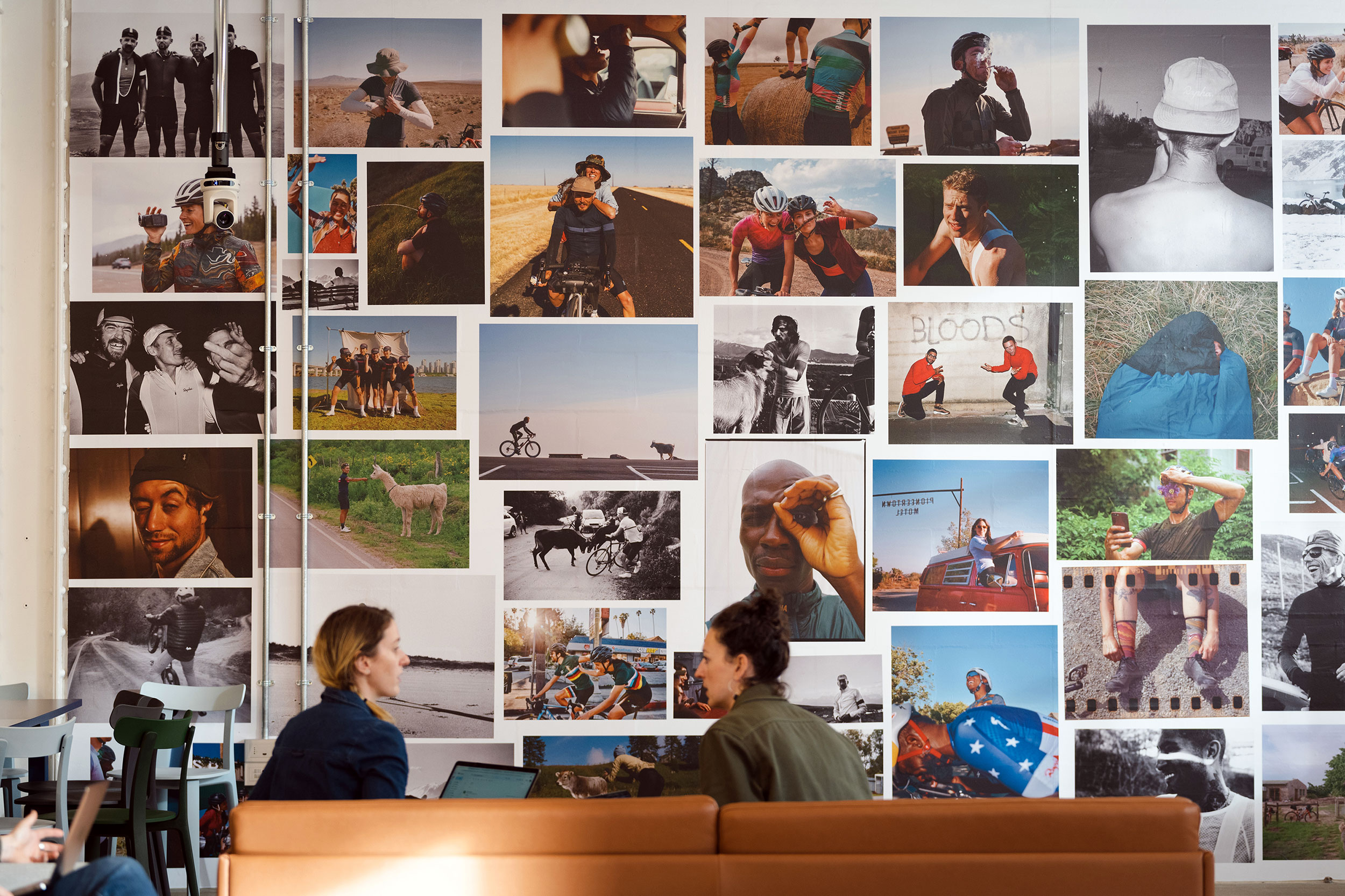
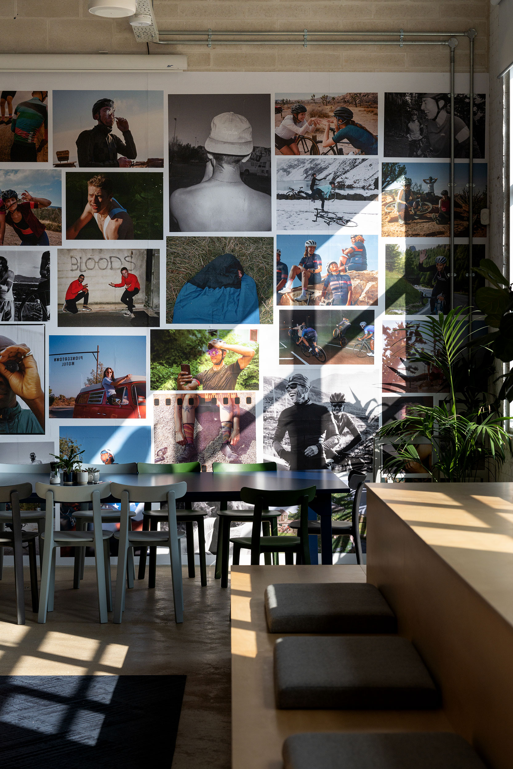
We wanted Rapha’s renowned photography, and its devil-in-the-details approach to design, to have a key role within the building. A feature wall of largely unseen images from their archive invites visitors to spend time with it, while a four-storey billboard outside the main entrance and elevated graphic expressions throughout the space help pace and punctuate the visitor experience.
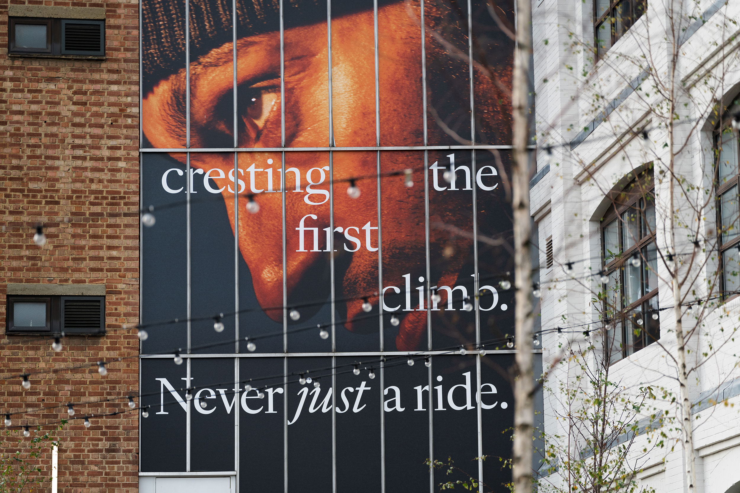
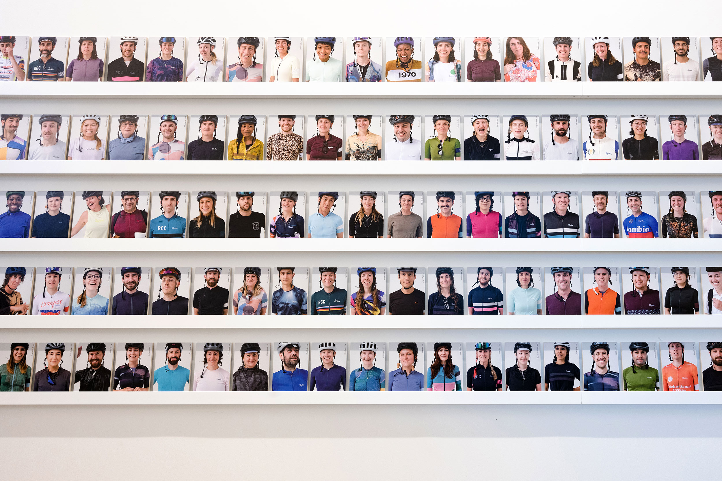
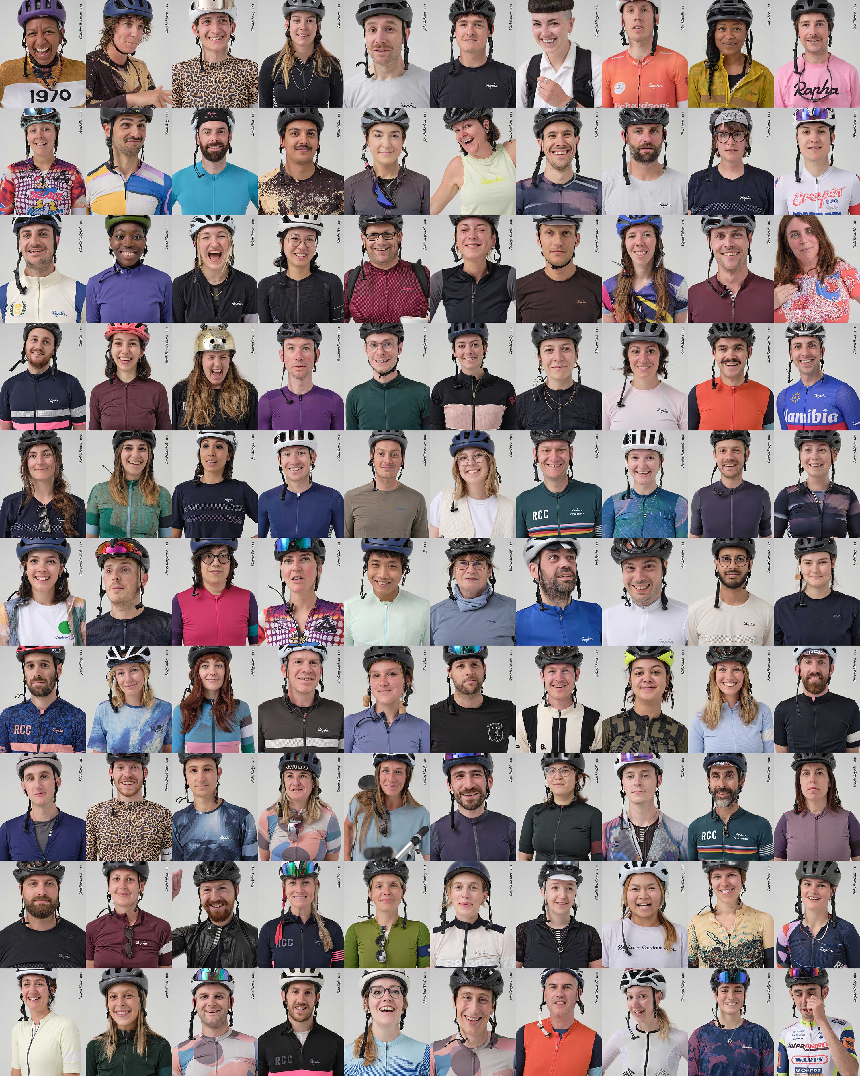
Last but not least, a workplace is nothing without the people that work there. Working with photographer Wig Worland, we art directed a series of staff member portraits. These pictures were shot over a period of a few months, as staff arrived at the office after the weekly Wednesday morning company rides.
Thank–yous & Credits
Client Leads: Francois Convercey & Caroline Crosswell
Client Creative Lead: Matt Tucker
Spatial Design: Edwin Foote
Copywriting: George Tyson
H–Van and Floor Artworks: Many Hands
Signage Fabrication: Standard8
Graphics Installation: KGK Genix
Rapha Portrait Photography: Wig Worland
Project Photography: Tian Khee Siong
WIP Photography: Oh Brother Creative
Identity Animation: Studio Lucas Hesse
