Stories that start with small details.
grain is a London-based Academy Awards®, Emmy and Bafta winning film production company founded by award-winning filmmaker Orlando von Einsiedel. We were honoured to be asked by Orlando and the team to develop grain’s brand identity.
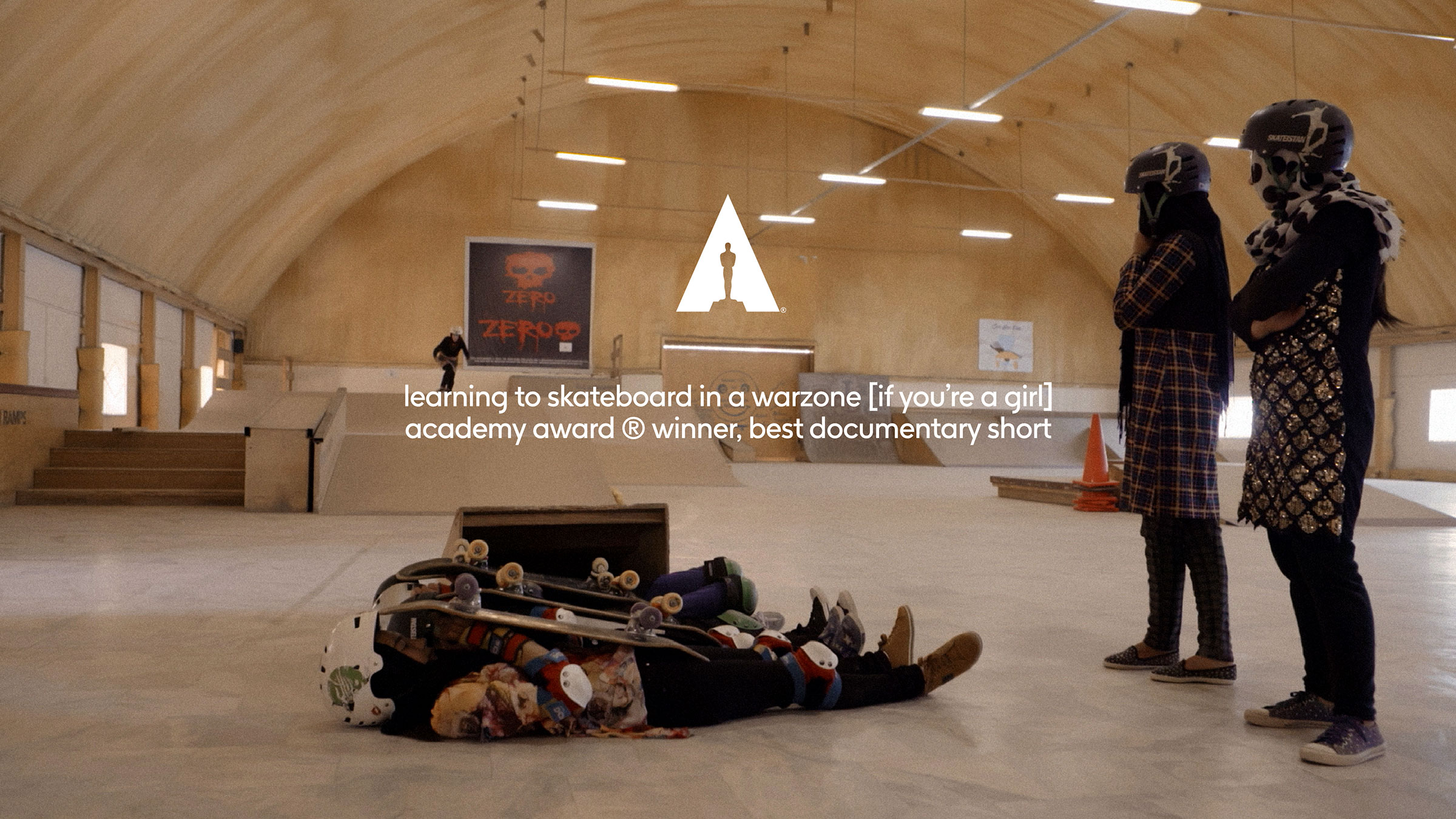
Since their inception in 2006 grain has gone on to win over 100 international film, television and advertising awards across multiple genres including two Academy Awards®, a BAFTA, an EMMY, a Peabody, a Grierson, IDA Awards, a BIFA and a duPont-Columbia Award for outstanding journalism. Notable recent success came at 2021’s Academy Awards®, with ‘Learning To Skateboard In A Warzone (If You’re A Girl)’ winning the Best Documentary (short subject) award.
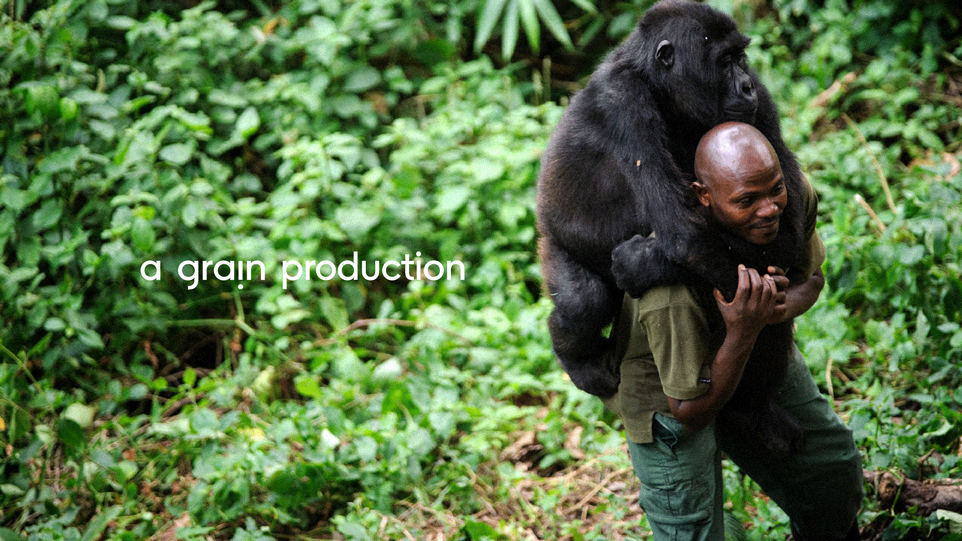
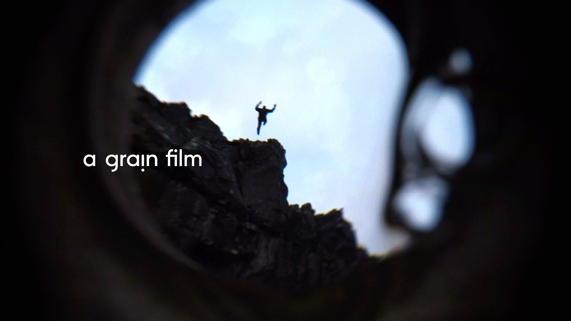
Rather than being defined by the ‘type’ of films they make, grain is known for the way they seek out and unearth purposeful stories, and their intimate approach to how they tell them. Focusing on inspiring narratives of humble heroism from around the world, grain’s films follow extraordinary characters whose unique, human stories speak to macro global issues.
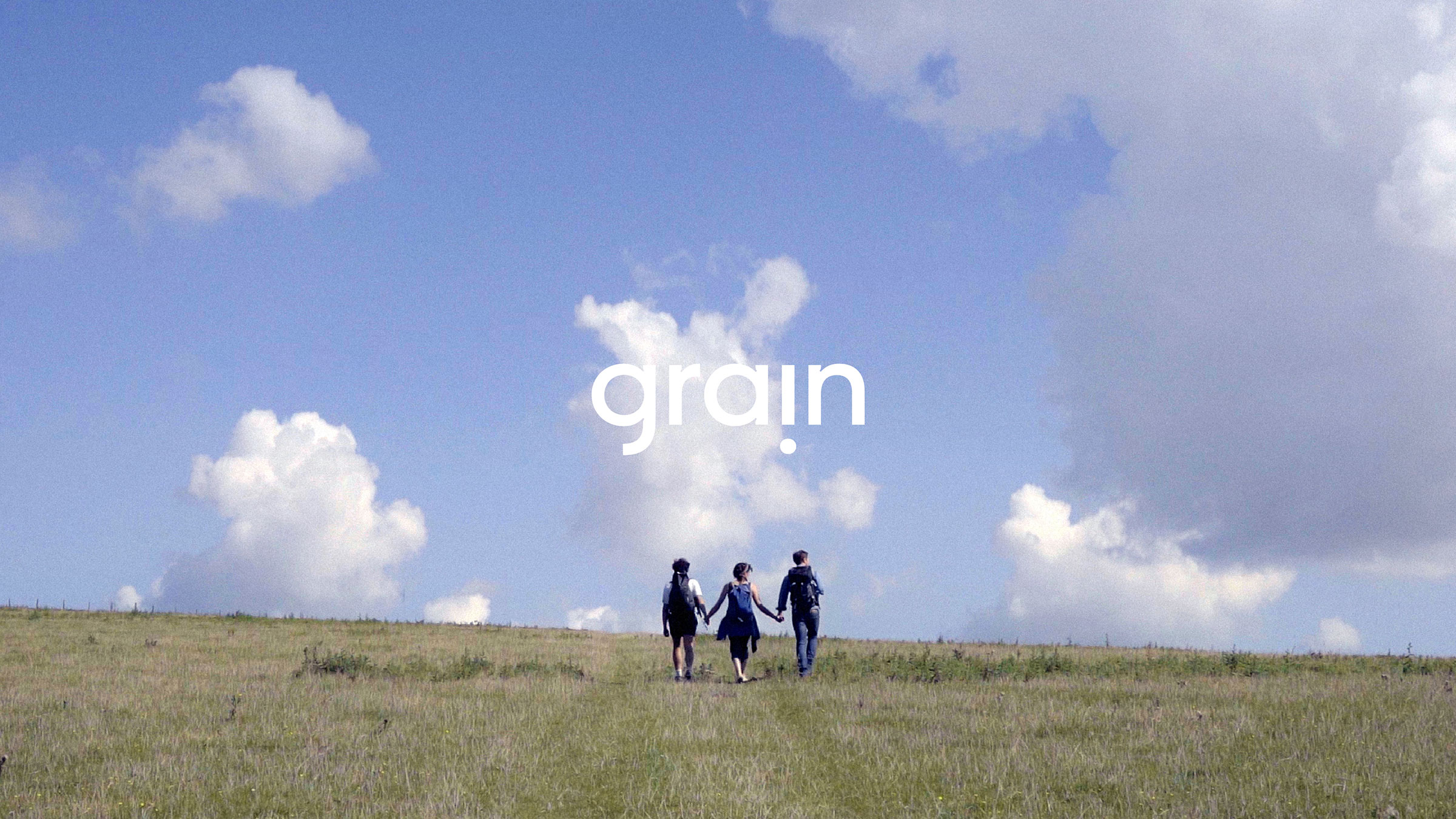
The logo springs from the dot (or tittle) of an upside down ‘i’ — symbolic of a single ‘grain of truth’ from which their powerful, often moving, stories grow.
Designed in minute detail, the logo features exaggerated ink traps and large contours to ensure it is highly legible at (very) small sizes, before revealing its charming idiosyncrasies when it is used at much larger scale.
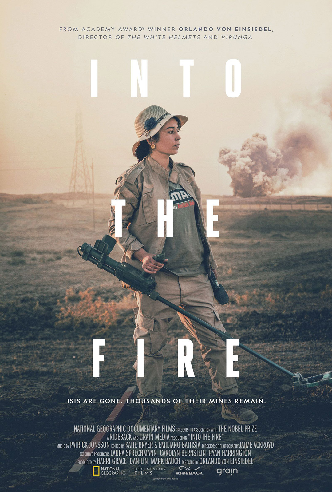
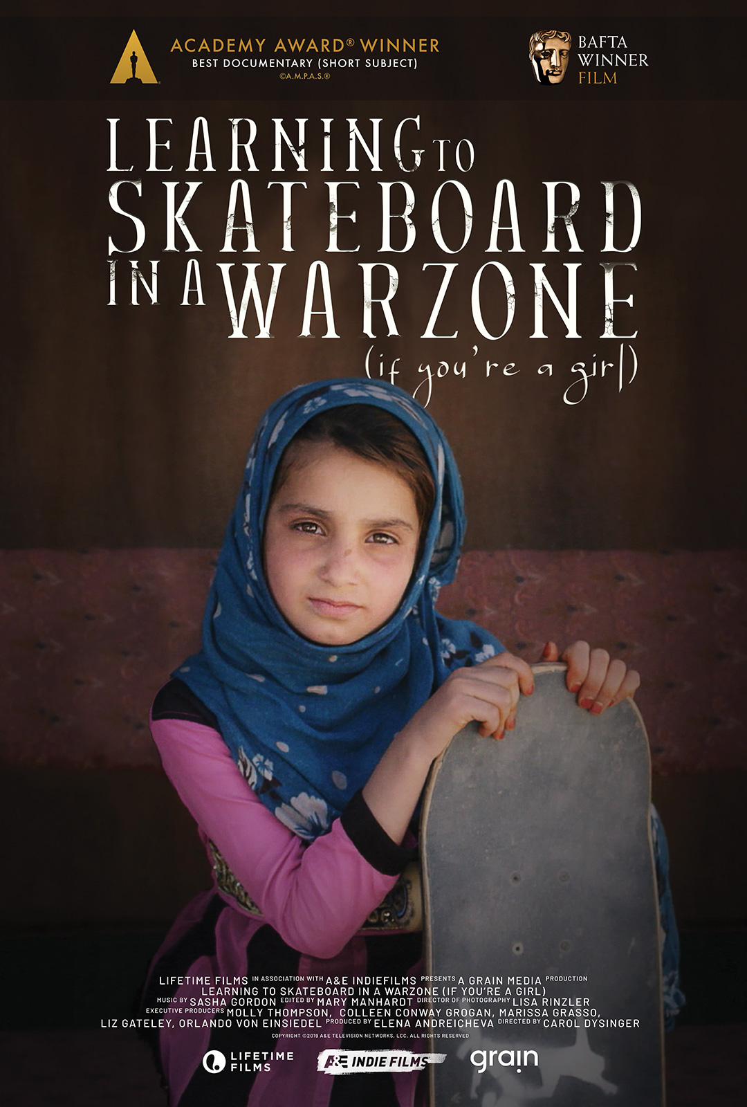
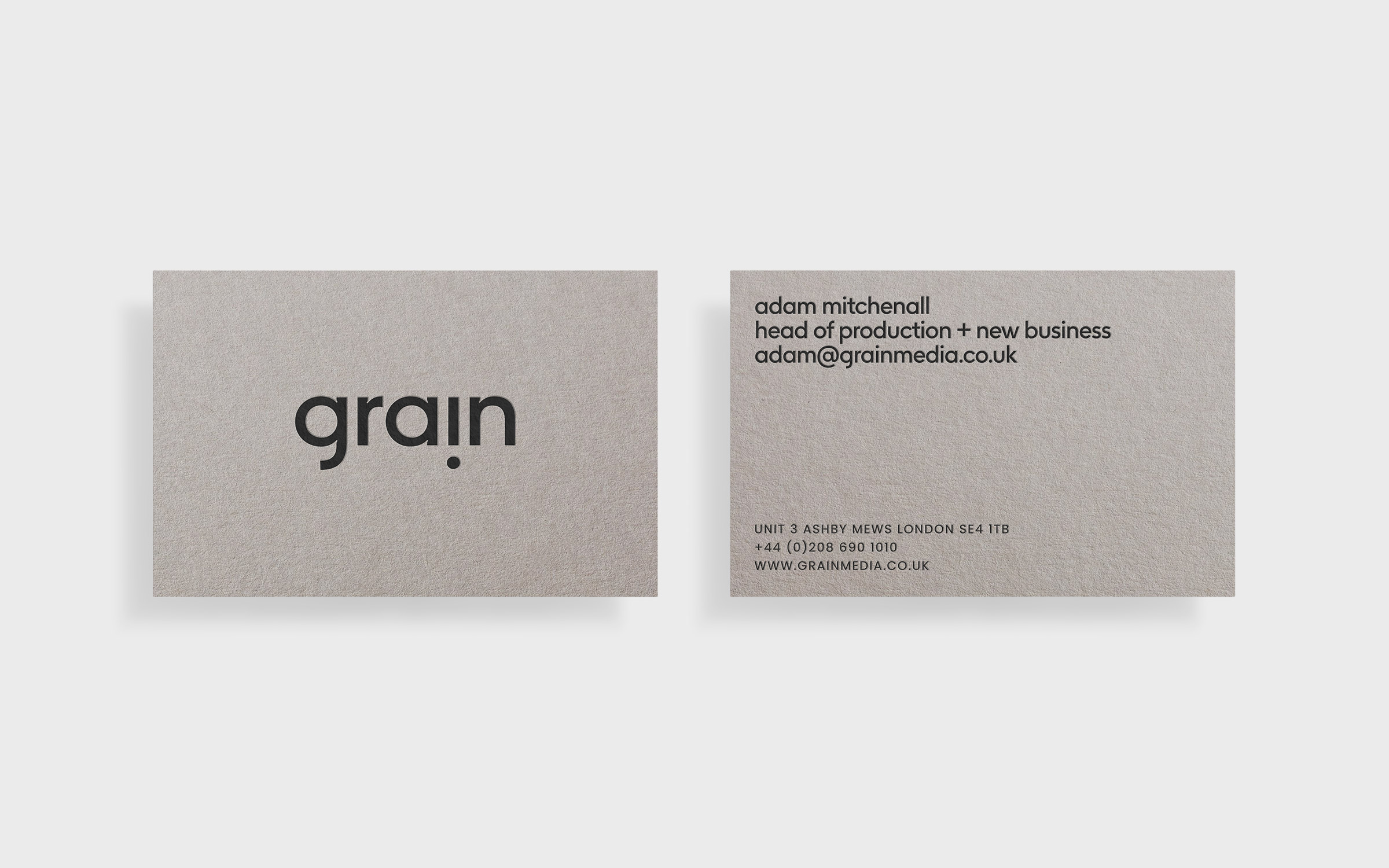
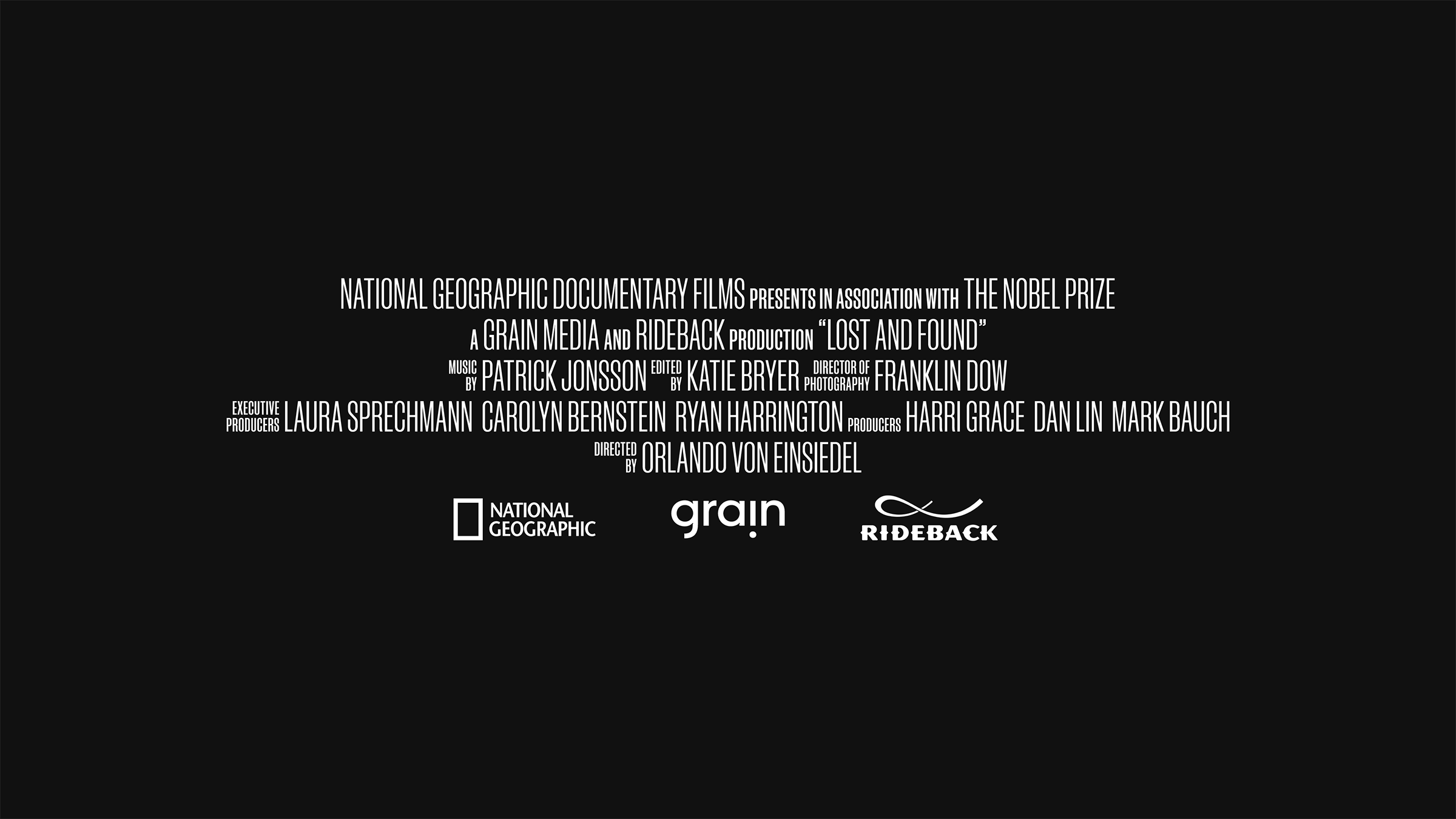
Alongside the logo, we also designed a series of typographic lock–ups, to support different divisions of the business — in showreels and pitch documents for example — as well as providing a simple system for creating new ones as opportunities or clients arise.
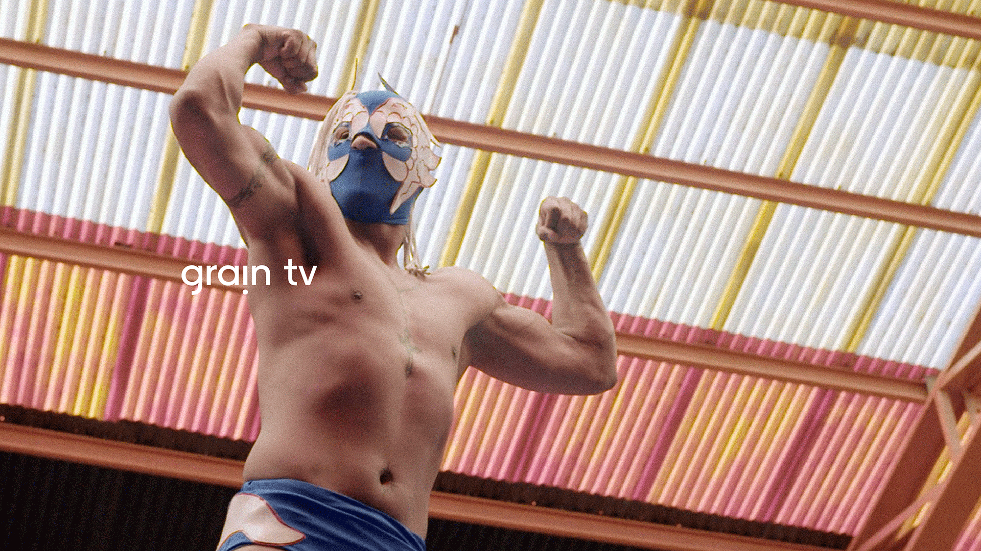
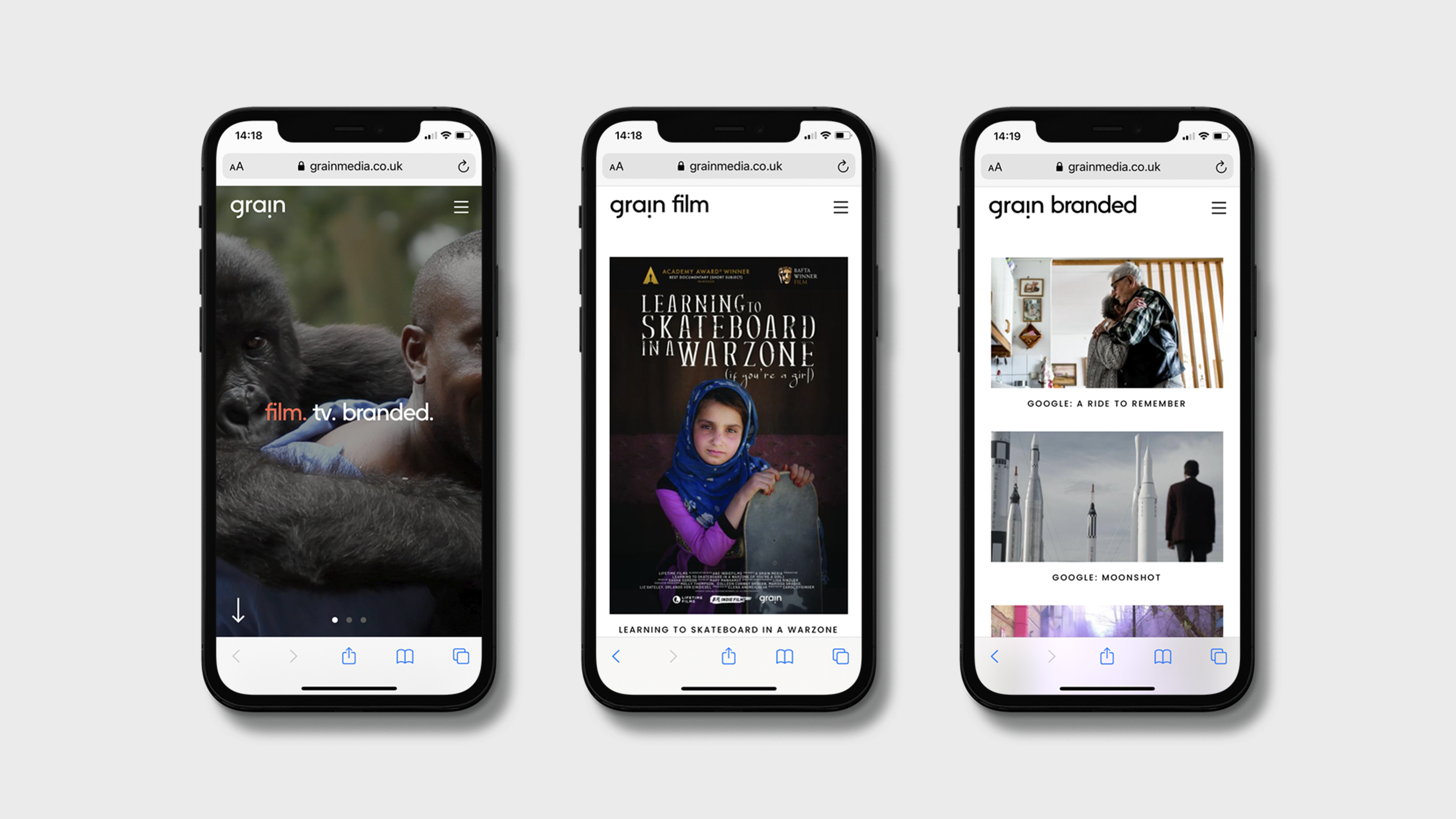
The website, developed by our friends at Engine, is one of best examples of grain’s brand identity system in use. A platform for grain to present all of their streams of work — from documentary and dramatic films, to broadcast television and commercials.